Jump to content


Photo

What Is A P&F Chart? PNF tutorial


  • Please log in to reply
5 replies to this topic

#1 TTHQ Staff

TTHQ Staff

    www.TTHQ.com

  • Admin
  • 8,597 posts

Posted 18 July 2007 - 01:12 PM

I've been getting requests for a PNF resource, a guide/tutorial/how-to-read kind of thing, so I'm putting it out there for y'all: Any takers on the subject... how to read a chart.....what it means.....how *you* use the PNF analysis... what patterns (if any) are you looking for..... a primer, if you will.

All I've got to offer as a start is from DecisionPoint:


What Is A P&F Chart?

P&F Chart The point and figure chart is a study of pure price movement in that time is not taken into consideration while plotting the price action. Since only price changes are recorded, if no price change occurs then the chart is left untouched.

Point & Figure charts use rising columns of X's and descending columns of O's to represent these price movements.

What an investor sees when looking at a P&F chart is the underlying supply and demand of the security. The columns of X's illustrate demand exceeding supply (rally), and the columns of O's illustrate supply exceeding demand (decline).

pnf24.gif

This article describes the mechanics of using P&F Charts.

How Are P&F Charts Calculated?

As stated above, Point & Figure charts show an "X" when prices rise by the amount of the "box size" (a value you specify) and show an "O" when prices fall by the amount of the box size. If prices rise or fall by an amount that is less than the box size, no X's or O's are drawn.

Each column contains a stack of either X's or O's, but rarely both (using a 1 box reversal can result in an X and O stack). Columns will always alternate between X's and O's, and in order to change columns, prices must reverse by the "reversal amount" (another value you specify) multiplied by the box size. For example, if the box size is 5 points and the reversal amount is 3 boxes, then prices must reverse direction 15 points (5 x 3) in order to change columns. If you are in a column of X's, the price must fall 15 points to change to a column of O's. If you are in a column of O's, the price must rise 15 points to change to a column of X's.

The columns of X's and O's represent price trends. So when a column changes, it likewise signals a change in the trend of prices. When a new column of X's appears, it shows that prices are rallying higher. When a new column of Os appears, it shows that prices are moving lower.

Because prices must reverse direction by the reversal amount, the minimum number of X's or Os that can appear in a column is equal to the "reversal amount."

It is common practice is to use the high and low prices (not just the close) to decide if prices have changed enough to display a new box.

Why Use A Point & Figure Chart?

While the SharpCharts workbench is a great tool for charting a security over a period of time, sometimes all an investor is interested in is the actual price movement. P&F charts are great for observing active market activity, and as such are very helpful in identifying support/resistance lines, buy/sell signals, and trendlines.

P&F charts are also very flexible in that they can easily be made more or less sensitive to price changes to discern between long and short term trends. By varying box and reversal sizes, these charts can be adapted to almost any need. There are also many different ways these charts can be used for entry and exit points. As such, all types of investors can benefit from an applied understanding of P&F charting.
Why Use A SharpCharts P&F Chart?

There are two types of SharpCharts P&F charts: Graphical and Text.

A Graphical P&F chart is created as a graphical image. It can provide more information and flexibility by offering more workbench tools than the text charts. Furthermore, graphical charts look great and can be stored inside of Favorite chart lists.

The Text (or "Classical") chart is a simpler style of P&F charting that uses the old-fashioned visual format. The Text P&F chart is created as a collection of text characters and can be viewed in any web browser.

Posted Image

This is an example of what a typical P&F chart might look like. It has the standard Chart Scale values and Chart Attributes with the "Trend Lines" overlay selected. Notice the time scale on the horizontal axis is not linear, P&F Charting tracks price action whenever it may occur.

ABC 123
Here we see rising columns of X's and falling columns of O's with numbers (1 - 9) and letters (A, B, C) placed within the columns. The number and letters are simply used as monthly indicators, allowing the user to have at least a rough idea of when these price movements occurred aside from the given year markers at the bottom. The numbers 1 - 9 correspond to months January thru September, and to save space, A B & C were assigned to October, November, and December respectively. Therefore, if you saw a "2" in the place of an X, that would indicate that the price rose by the box value in the month of February. Keep in mind that the "2" would not necessarily indicate February 1, it simply signifies that the price movement occurred in the month of February.
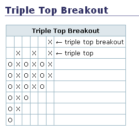
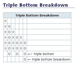
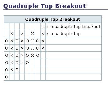
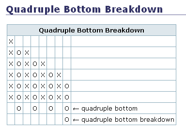
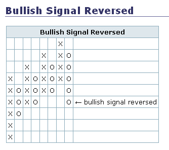
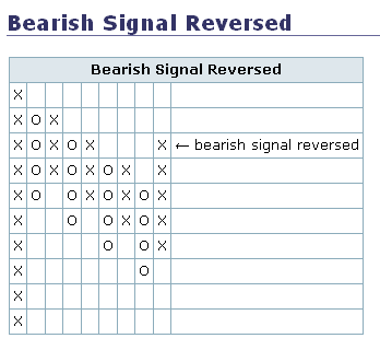
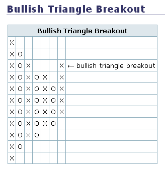
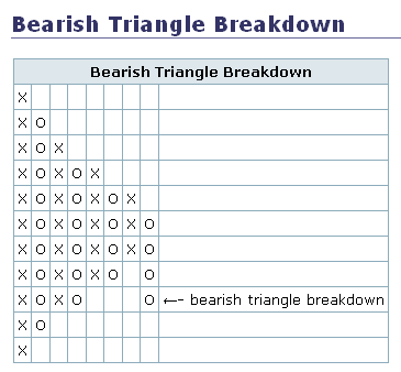
Buy/Sell Signals

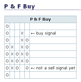
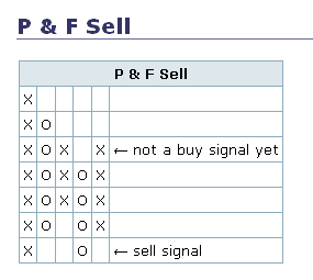
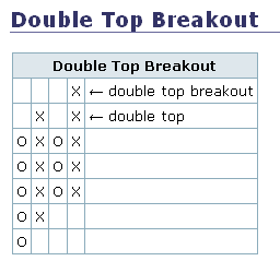
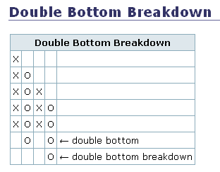
Upside and downside breakouts can be used as buy and sell signals respectively, and are also vital in the construction of trend lines. When a column of X's rises one box above the top of a previous X column, a buy signal is given. Contrarily, when a column of O's declines one box below a previous O column, a sell signal is given. Decreasing the Box Size will yield more signals as the charting will become more volatile.

Trend Lines

P&F trend lines do not follow the exact same conventions as trend lines for bar charts, and are much less subjective. First, they do not necessarily have to connect previous tops or bottoms. Second, the way they are constructed will always result in them being charted at 45 degree angles (or 135 degrees if decreasing). The red lines represent bearish resistance while the blue lines represent bullish support. From the example chart, notice how the blue support lines are constructed after a buy signal and the red resistance lines are constructed after a sell signal.

Price Objectives
Our P&F charts display a price objective on the vertical price scale as PO. A P&F price objective is the price that a stock should reach based on recent P&F chart signals. Price objectives should not be used as the sole reason for buying or selling a stock - they function simply as a guide based on what the current P&F chart is saying. Stocks frequently move past the price objective and just as frequently reverse before getting to the price objective. The best way to use a price objective is as a cautionary sign - if prices get to the price objective, it might be prudent to monitor the stock more closely and move stops closer in case the move is done.

#2 TTHQ Staff

TTHQ Staff

    www.TTHQ.com

  • Admin
  • 8,597 posts

Posted 18 July 2007 - 01:23 PM

P&F Pattern alerts

Here is a list of the various kinds of P&F chart patterns. Buy and Sell signals are very simple patterns that should be confirmed before placing a trade. The P&F Buy signal is used when calculating the various Bullish Percent indices.
Posted Image

When the last signal on the chart was a buy signal, that is, the last breakout was a column of Xs going higher than the previous column of Xs and no sell signal (no column of Os breaking below the previous column of Os) has happened since the buy signal.
 
Posted Image

When the last signal on the chart was a sell signal, that is, the last breakout was a column of Os going lower than the previous column of Os and no buy signal (no column of Xs breaking above the previous column of Xs) has happened since the sell signal.


Double tops and bottoms are the simplest point and figure patterns to identify and are the building blocks of all other patterns.

Posted Image

For a double top, prices rise to a certain level and then retreat because the supply outstripped the demand at that level. If prices rise again to the level at which they retraced before, it is called a double top. If prices continue to carry through that level, a double top breakout is recognized by our alert system. The double top breakout alert implies that the buyers are now creating more demand than there is supply at the level of the double top and we have a breakout.

Posted Image

A double bottom is similar, but in reverse. Prices fall to a certain level and then reverse because the demand outstripped the supply at that level. If prices fall again to the level at which they stopped before, it is called a double bottom. If prices continue to fall through that level, a double bottom breakdown is recognized by our alert system. The double bottom breakdown implies that the buyers who were supporting the price are no longer able to create demand that is more than the supply, and prices are breaking down.
Posted Image

A triple top breakout is similar to a double top breakout except that the price at which the breakout occurred is a price that the chart retraced from two times before. This implies that the price level is a more significant area of resistance (area where sellers are willing to sell the stock and create supply that outstrips demand) than what is seen on a double top. The breakout above this level implies that the buyers are now creating more demand than there is supply and therefore the prices are breaking out.
Posted Image

A triple bottom breakdown is similar to a double bottom breakdown except that the price at which the breakdown occurred is a price that the chart retraced from two times before. This implies that the price level is a more significant area of support (area where buyers are willing to buy the stock and create demand that outstrips supply) than what is seen on a double bottom. The breakdown below this level implies that the sellers are now creating more supply than there is demand and therefore the prices are breaking down.
Posted Image

A quadruple top breakout is similar to a triple top breakout, except that the prices break out after retracing from the same level three times. The fourth time the demand was able to outstrip the supply at the price level, and prices broke out with a quadruple top breakout.
Posted Image

A quadruple bottom breakdown is similar to a triple bottom breakdown, except that the prices break down after retracing from the same level three times. The fourth time the supply was able to outstrip the demand at the price level, and prices broke down with a quadruple bottom breakdown.
Posted Image

A double top followed by another double top, or three tops, each higher than the previous is recognized as an ascending triple top breakout. The idea is that demand is continuing to outstrip supply on an ongoing basis.
Posted Image

A double bottom followed by another double bottom, or three bottoms, each lower than the previous is recognized as an descending triple bottom breakdown. The idea is that supply is continuing to outstrip demand on an ongoing basis.
Posted Image

A triple top breakout followed by a double top breakout is recognized as a bullish catapult breakout. The implication is that there was supply at the triple top level that was keeping prices from going up, but the triple top breakout took some of that supply away. Prices then retraced, allowing more buyers to create demand which continued to power the up move in prices.
Posted Image

A triple bottom breakdown followed by a double bottom breakdown is recognized as a bearish catapult breakdown. The implication is that there was demand at the triple bottom level that was keeping prices from falling, but the triple bottom breakdown took some of that demand away. Prices then reversed up, allowing more sellers to create supply which continued the selling which broke below the double bottom level creating the bearish catapult breakdown.
Posted Image

This pattern is a series of rising tops and bottoms that finally soaks up all demand and the double bottom breakdown at the end signals that now supply is outstripping demand.
Posted Image

This pattern is a series of falling tops and bottoms that finally soaks up all the supply and the double top breakout at the end signals that now demand is outstripping supply.
Posted Image
Posted Image

Triangles are formed when both the supply and demand for the stock are drying up. Prices are unable to rise but neither are they able to fall, there is an equilibrium between the buying and selling as is seen by the rising bottoms and the falling tops that form the triangle. This stalemate between buyers and sellers is finally resolved by a double top breakout in the case of a bullish triangle breakout, or by a double bottom breakdown in the case of a bearish triangle breakdown. This is one of the most reliable patterns out of all the patterns recognized by the system.
Posted Image

This pattern is recognized when the prices drop 20 boxes or more. After such a steep decline, the first reversal provides a good trading opportunity, but the steep drop should give the buyer pause.
Posted Image

A bull trap is a triple top breakout followed by a reversal after only one box is made in the triple top breakout. The breakout is possibly due to buy stops being hit just above the resistance level, and the quick reversal suggests lower prices ahead.
Posted Image

A bear trap is a triple bottom breakdown followed by a reversal after only one box is made in the triple bottom breakdown. The breakdown is possibly due to stop loss orders or short orders being hit just below the support level, and the quick reversal suggests higher prices ahead.
Posted Image

A spread triple top breakout is similar to a triple top breakout except that the price at which the breakout occurred is a price that the chart retraced from two times before in the recent past. The two times do not have to be immediately preceding the current column. This alert implies that the price level is a significant area of resistance (area where sellers are willing to sell the stock and create supply that outstrips demand). The breakout above this level implies that the buyers are now creating more demand than there is supply and therefore the prices are breaking out.
Posted Image

A spread triple bottom breakdown is similar to a triple bottom breakdown except that the price at which the breakdown occurred is a price that the chart retraced from two times before in the recent past. This implies that the price level is a significant area of support (area where buyers are willing to buy the stock and create demand that outstrips supply). The breakdown below this level implies that the sellers are now creating more supply than there is demand and therefore the prices are breaking down.

Posted Image
The high pole warning is given when a chart rises above a previous high by at least 3 boxes but then reverses to give back at least 50 percent of the rise. The reversal implies that the demand that was making the prices rise has given way to supply pressure. The pattern is a warning that lower prices could be seen in the future.
Posted Image

The low pole reversal is seen when a chart falls below a previous low by at least 3 boxes but then reverses to rise by at least 50 percent of the fall. The reversal implies that the supply that was making the prices fall has been absorbed and demand is taking over. The pattern is an alert that higher prices could be seen in the future. The ideal buy point would be on another reversal back down to be closer to the stop loss point. This would also set up a double top breakout if the prices reverse up and break over the current column's high.


#3 mss

mss

    I'M WATCHING

  • TT Sponsor
  • 6,182 posts

Posted 18 July 2007 - 02:22 PM

:)
They are very useful in many ways. You must understand what they mean to use and that is easy.

PnF CHARTS

More info here.
mss
WOMEN & CATS WILL DO AS THEY PLEASE, AND MEN & DOGS SHOULD GET USED TO THE IDEA.
A DOG ALWAYS OFFERS UNCONDITIONAL LOVE. CATS HAVE TO THINK ABOUT IT!!

#4 hiker

hiker

    independent trader

  • TT Member*
  • 12,118 posts

Posted 20 July 2007 - 06:42 PM

once you adjust to reading the X's and O's on a PnF chart ..and learn what the terminology means..then you are faced with: are they predictive? not for more than short price runs in many cases....I keep stats on what happens month after month and year after year once a PnF alert is given....it is such a mixed bag, that clearly the chart breakdown or breakout alerts are not sustainable as a predictive tool for more than a limited period of time what is one good use for PnF chart? it tells you whether supply or demand for the stock is in control, and within that dynamic whether a 3 or 4-box "customary" consolidation reversal is in play. -------------- let's see an example of what happened with the PnF breakout alert for ISRG in July 2006 - real-time email I sent on that date: 7/19 later intraday update as of 1:56 p.m. - PnF chart today has signaled a double top breakout alert on the move to $122.00..sustaining a move into the 122-124 zone is the next area of interest on the PnF chart what followed this failed breakout alert, was much chop with a subsequent swing low in January 2007 of $86.20 before the rally caught steam again in February and never looked back ...making new HISTORIC high today. this example does highlight that a PnF chart is useful for quickly identifying where horiziontal resistance and support resides on the price chart...simply look across and note the density and stopping places for price advances and declines. -------------- it still boils down to taking action on a timely basis when price action signals the trader that prior resistance has become support or vice versa.

Edited by hiker, 20 July 2007 - 06:50 PM.


#5 Rogerdodger

Rogerdodger

    Member

  • TT Member*
  • 26,872 posts

Posted 28 July 2007 - 12:40 PM

These P&F charts were posted on the Gold board on Saturday July 21st
They did not tell what would happen but they did say that there was strong resistance at the red line.
If broken to the upside, it should result in a nice run.
Neither one broke out, but sold off all the next week along with the general market.

Set your buy stops!
Posted Image


And Triple Top Resistance:
Posted Image


As you can see, these are very good at visually identifying horizontal support and resistance.


As well as diagonal support/resistance.

#6 Rogerdodger

Rogerdodger

    Member

  • TT Member*
  • 26,872 posts

Posted 26 December 2007 - 12:13 PM

What about P&F "Price Objectives" on Stockcharts:

From Stockchart's Chip Anderson:

Remember, just below every P&F chart is a link called "About Price Objectives".

It leads to our ChartSchool article with all the gory details about how we calculated P&F Price Objectives and it contains numerous warnings about how they should be used. I urge everyone to read that page carefully but the bottom line is this:

Price Objectives are simplistic and very unreliable.

At best, they represent an upper (or lower) bound for the stock's next big movement. At worst, they are ammunition for scam artists.

So why have Price Objectives at all? Price Objectives hark back to the early days of Point and Figure charts when Technical Analysis was still in its infancy. Things like Bollinger Bands, MACDs, and MarketCarpets had not been invented then and Price Objectives were the best people had. Don't get me wrong, when properly understood, Price Objectives can be another useful tool for any chartist. Unfortunately, most people do not take the time to understand them and the scam artists count on that fact when posting their garbage.
Don't be fooled.

- Chip Anderson


Edited by Rogerdodger, 26 December 2007 - 12:30 PM.