The NEoWave "Question of the Week" section of the website is being upgraded currently, so instead I thought some graphs on the history of bank failures would be interesting.
The attached chart shows the number of U.S. bank failures, per year, plotted since 1934. It makes clear that the current bank-failure rate is very low compared to the 1980's and early 1990's.
A second chart will follow that will shock you.
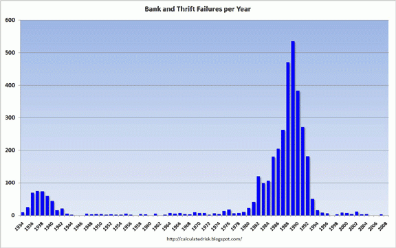
On Chart 1, from 1934 to 2008, it showed 1989 as the peak of the worst decade of U.S. bank failures, with 1936 coming in a distant second.

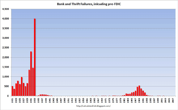
On Chart 2, the period from 1921 to 1933 dwarfs the 1980's in the number of bank failures with its peak in 1933 producing 700% more failures than that reached during the zenith of the 1980's!
What does NEoWave say about this? Since the correction that began in 2000 will be more damaging and more prolonged than since 1966, but of one less degree than the 1929-1932 stock market crash, we can assume bank failures over the next 10 years will be greater than that seen in the 1980's, but fewer and less severe than that experienced in the 1920's and early 1930's. Based on structural evidence, I expect the number of U.S. bank failures to peak around 2010 and 2011, with the worst period showing 300-400 failures per year.
Glenn Neely
NEoWave, Inc.

 On Chart 1, from 1934 to 2008, it showed 1989 as the peak of the worst decade of U.S. bank failures, with 1936 coming in a distant second.
 On Chart 2, the period from 1921 to 1933 dwarfs the 1980's in the number of bank failures with its peak in 1933 producing 700% more failures than that reached during the zenith of the 1980's!
What does NEoWave say about this? Since the correction that began in 2000 will be more damaging and more prolonged than since 1966, but of one less degree than the 1929-1932 stock market crash, we can assume bank failures over the next 10 years will be greater than that seen in the 1980's, but fewer and less severe than that experienced in the 1920's and early 1930's. Based on structural evidence, I expect the number of U.S. bank failures to peak around 2010 and 2011, with the worst period showing 300-400 failures per year.
Glenn Neely
NEoWave, Inc.
On Chart 2, the period from 1921 to 1933 dwarfs the 1980's in the number of bank failures with its peak in 1933 producing 700% more failures than that reached during the zenith of the 1980's!
What does NEoWave say about this? Since the correction that began in 2000 will be more damaging and more prolonged than since 1966, but of one less degree than the 1929-1932 stock market crash, we can assume bank failures over the next 10 years will be greater than that seen in the 1980's, but fewer and less severe than that experienced in the 1920's and early 1930's. Based on structural evidence, I expect the number of U.S. bank failures to peak around 2010 and 2011, with the worst period showing 300-400 failures per year.
Glenn Neely
NEoWave, Inc.


