

This is from our April 5, 2010 letter:
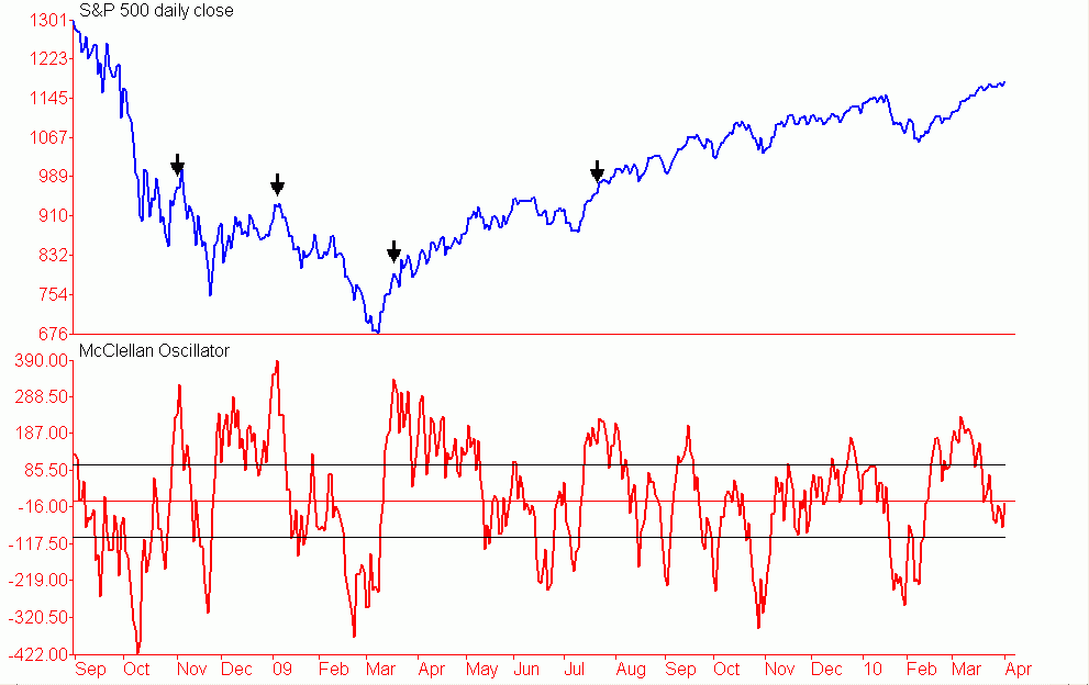
The market has so far exhibited classic behavior following a bona fide initiation signal. The deep overbought condition from early to to mid March has been fully worked off with no damage at all to price. in fact the S&P closed Friday 3.5% above whre4e it stood at the peak momentum reading seen on March 5. As we discussed last time., this is very similar to what we saw in late July/early August and to a lesser degree in late March early April. While some are focusing on the fact that momentum relative to price is weak we are focusing on the bullish historical correlations to this same set up. There is a clear and consistent pattern that unfolds when the strong momentum reading fails. This is simply confirmed by the reaction of price which fails to hold up as the indicators begin to work off their overbought condition. We can see on the chart below two failures, one in November 2008 and one in January 2009. The one thing that stands out in both instances is that as soon as the indicator, in this case the McClellan oscillator, began to turn down the S&P followed suit.
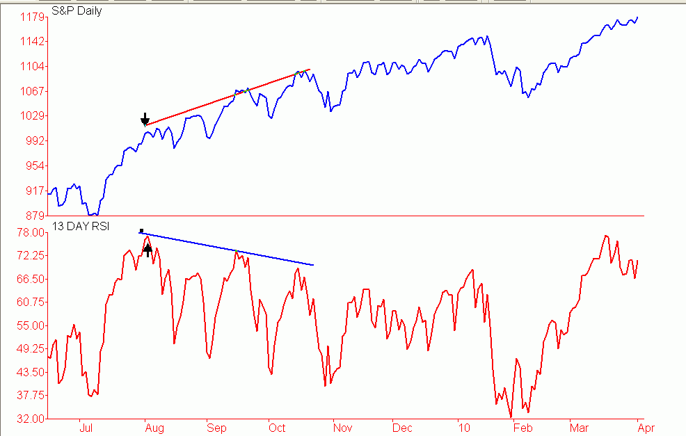
We can also see on the chart in both March and July of last year that the S&P continued to rally, albeit at a much slower pace while the overbought condition as being worked off. The market did exhibit much more strength in the March-April period then it did in July or recently as the McClellan oscillator held above zero all the way into May. We are not surprised by this as that was the first initiation signal of the new bull market. We are seeing similar type readings from a number of other indicators including our own breadth oscillator. The volume based indicators did reach levels of strength but are lagging behind their breadth counterparts. Another indicator that is showing a similar pattern is RSI. The 13-day RSI for example hit is best level of the bull market in mid March. Readings this high are bullish and occur near the beginning of an advance not the end of one. The initial divergences on this indicator like others that on other indicators tend to fail most all of the time. The fact that weekly RSI has also confirmed only adds to the positive implications from the daily measure. We can see on the chart below that following the peak in RSI in early August that the first real divergence lead to nothing more than a minor correction that was followed by a resumption of the rally from several more weeks.
The majority of the potential negatives are just that potential negatives. Not one of the potential divergences are close to being confirmed so we do not even know at this time if the first divergence is even in place. There is room for the majority of the indicators to move lower and get closer to oversold levels. However, this is not a necessary ingredient after an initial thrust signal. The fact is that hey have done all they need to do to correct the deep overbought condition that was prevalent in early to mid March and as we pointed out earlier they have done this with the averages moving up not down. While we do have a number of potential short-term negatives there are a lot of positive developments. And unlike the potential short-term negatives the positive developments are in fact real. This includes the new highs in nearly all of the important A/D lines. Even the A/D line for the DJIA has made new highs from March 2009 and is only five units away from taking out its 2007 peak and moving to new all time highs.
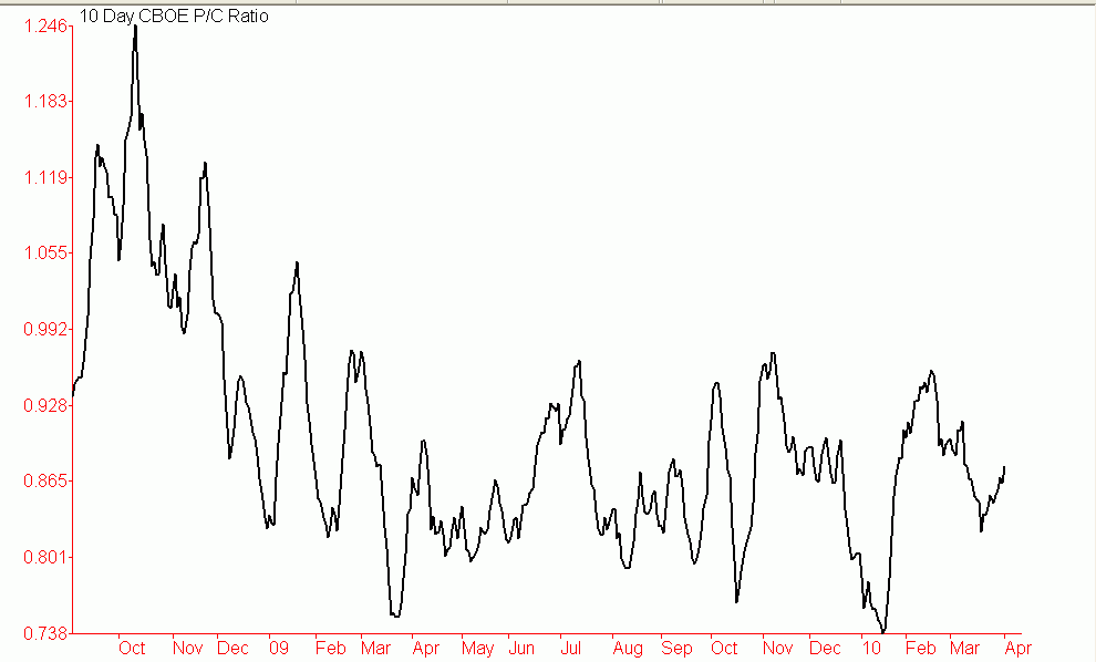
The biggest negatives we see remain in the sentiment area. We have seen some deterioration in some of the sentiment polls but so far the majority of the indicators are still below their early January peaks. The one area that stands out from a bullish perspective is the American Association of Individual Investors (AAII). This important survey continues to show a high degree of skepticism regarding the rally from last March at least from the public. Bull markets do not end with the public not participating, they end with the public into it up to their eyeballs. The one indicators that is a concern is the equity put to call ratio. The 10-day moving average is at levels seen in mid October and mid January. Both of those lead to short-term corrections. However, the CBOE put to call ratio is nowhere close to where it stood in mid October and mid January. As we can see on the chart below the 10-day moving average of the CBOE put to call ratio is actually a little closer to where it stood in early February rather than mid January.
Sentiment can be a problem but in periods of strong momentum sentiment usually takes a back seat. And we are clearly in the midst of strong momentum and participation indicators are almost unanimously confirming. Very short-term we can not rule out some further weakness or consolidation. This should become a lot more clear this week but as we have said over the past several days we do think that any further weakness over the near term will be fairly well contained due primarily to the strong bullish position of the medium and long-term indicators
Go to www.marketsummaryandforecast.com to sign up for a free two week trial to our services


