 Now look at the same stochastic fractal in 2003. Same pattern with Price, MACD, and RSI. What followed was a continuation of rising prices.
Member
Posted 13 November 2009 - 11:45 PM
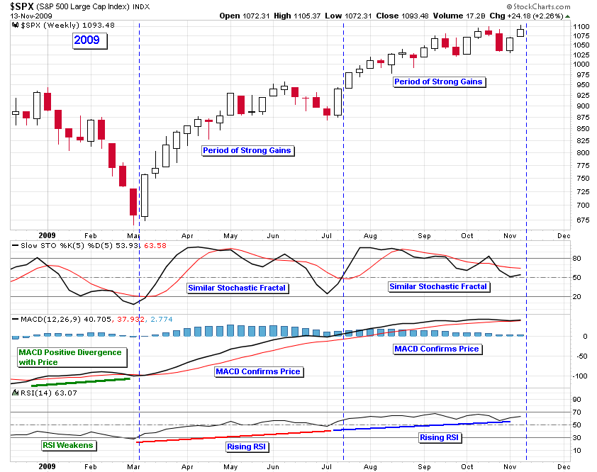
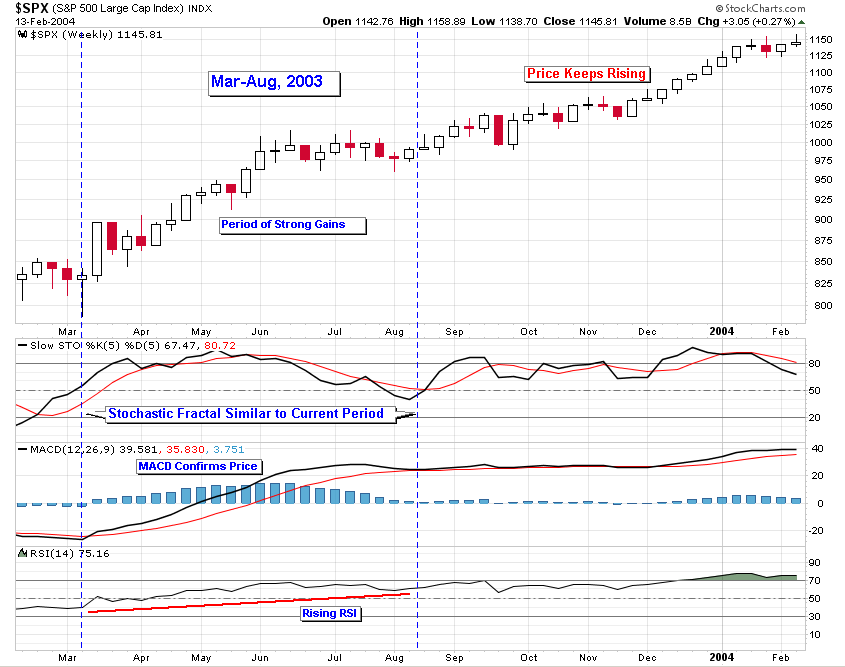
Now look at the same stochastic fractal in 2003. Same pattern with Price, MACD, and RSI. What followed was a continuation of rising prices.
Member

Posted 14 November 2009 - 12:17 PM
Member
Posted 14 November 2009 - 03:30 PM
 Good trading, D
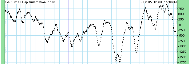
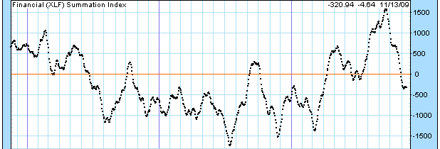
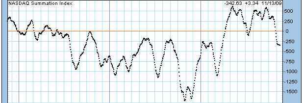
And speaking of echos (phase II echoing phase I), Below are MACD's of the NYSI for 2009 (upper chart) and 2003 (lower chart), as a sort of continuation of my string below. The phases of each advance are easily seen with aid of the MACD this year as in 2003. The similarities between 2009 are 2003 are, I think, striking, as this year echoes 2003. If it indeed plays out the same, then we have one more pullback to perhaps the 1000 area, then the final 'run for the roses' into 2010, before a meaningful IT decline. Just my view. D
http://stockcharts.com/c-sc/sc?s=$NYSI&p=D&yr=1&mn=0&dy=0&i=p72349161033&a=178151037&are=5548.png
http://stockcharts.com/c-sc/sc?s=$NYSI&p=D&st=2002-09-01&en=2004-01-01&i=p27177833900&a=177884449&are=359.png
Member
Posted 14 November 2009 - 08:56 PM


