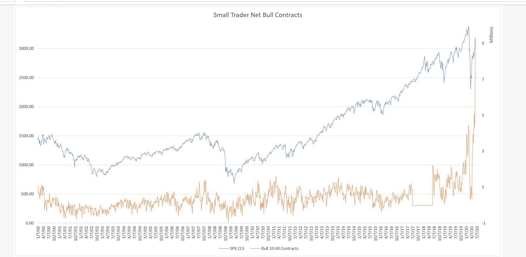
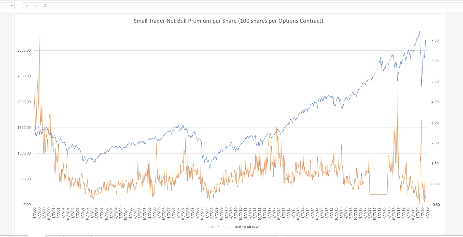
Here is a look at the Small Trader Net Bull Options Strategy based on the overall total cost in premiums paid and received. (BTO Calls plus STO Puts) minus (STO Calls plus BTO Puts). Keep in mind that long term OCC Options data on Equities does not compare apples to apples since in the early years of ETF development any options that were available were included in the equity reports. Even now with a separate ETF report, Long vs Inverse option trades are not separated. I'm not sure of the dates, but the last 7-8 years are probably equity only now. Will show the contract chart next. Note: I'm missing about a year of data in both charts as seen by straight line.
Looking at that chart, what I see is that the chart is near the same level that the market absolutely crashed from in Feb.....
Whenever I see super record anything, my hackles go up...we 'll see how this one play out.
Still leaning toward bullish resolution of any decline this week, but on alert for anything that flips things in bears favor for longer than that....
What do you think is going on?
Looking at premium numbers combined with contract numbers, seems like a ton of cheap out of the money calls must be being bought.
My point being that perhaps you cant just look at premium paid in a vacuum...as Feb was record Calls minus Puts in terms of Contracts as well.
What did the contract numbers look like at those prior times when the premium paid WAS a bullish indication....because it certainly was not in Feb. ( and I note it was record low on that chart)
Edited by K Wave, 15 June 2020 - 07:33 AM.