
Recently, in the wake of the dramatic, catalyzing events associated with the COVID-19 pandemic, analysts have struggled to match the action in the Economy with that of the Financial System. Existing disparities of inequality and maldistribution have been dramatically exacerbated as the financial indices have soared. In no quarter is there found any real explanation for the utter failure of all existent theories to anticipate or explain our current experience. The general reaction is one of befuddled annoyance. Irrespective of viewpoint, left or right, economists and market analysts are trying to figure out why the emergent reality does not conform to their model of how things should be and the default tendency is to wag a finger of blame at the other side of the aisle.
TheoriesLet’s examine the current existing views on the mismatch between the economic crisis and the action in the financial system.
The “Disconnect Theory” retreads the Austrian view that has been around since Nixon first disconnected the dollar from the gold standard. It basically states that action in the Financial System is so far our of whack with the metrics of what are generally perceived to be “The Fundamentals” that, eventually, this disparity will have to collapse in on itself.
The “Fed Theory” is an extension of the time-honored neo-Keynesian “Don’t Fight the Fed” party line. It abandons any pretense of analysis and advocates for a fully lobotomized world-view. “Don’t bother to make any sense of it at all…cuz Fed”.
The minority "Fundamentalist Theory" assures us that the action in the Financial System is reflecting something fundamental. Most often that "something" is defined well within the parameters of established economic performance metrics. We are assured that GDP, employment, corporate profits, P/E ratios and other time-honored measures will inevitably reflect the soaring valuations being priced into the Nasdaq 100 and S&P 500.
The "Secular Systemic Shift Theory", an outlier minority viewpoint, sees the current period as a transition to a fundamentally new underlying economics requiring a thorough update and revision of all economic theory and a new set of analytical tools. This is a variant on the Strauss/Howe "Fourth Turning" generational shift perspective. While most "Fourth Turning" advocates see the current situation as a transition within the same Capitalist system, the proponents of this view see the present shift as both Secular and Systemic.
At BullBear Trading, we have been tracking the arrival of a “Secular Shift”, a phenomenon roughly equivalent to the Strauss/Howe “Fourth Turning”, since 2012. In 2018 I started to identify 2020 as the year that the “Shift” would make itself known. The combination of financial and economic crisis, de facto Civil War and de facto major power war between the US and China is the symptomatic manifestation of an underlying fundamental, systemic paradigm shift in progress.
In a recent essay, “Information is the New Capital”, I began to introduce some elements of a correlated paradigmatic shift into our understanding of Economics and its application to the Financial System. I recommend that readers have a look at that before they dive into the present analysis.
QuestionsWhat if there is no “disconnect”? What if the actual disconnect is between our understanding of the true, current underlying mechanisms of the Economy and the function of the Financial System in relationship to it? What if there is simply no existing theoretical framework which encompasses and embodies the reality of our emergent economic system? What if we are in the process of a fundamental, secular, systemic paradigm shift which is largely unrecognized? What if all actors of influence in the social, political and intellectual milieux, on both the right and the left, are so fundamentally invested in their respective, competing ideological perspectives that they are unable and unwilling to objectively evaluate a world-historic process of change as it unfolds around them?
In the present essay and in the near future, we are going to ask these and other worthwhile questions and begin the process of answering them.
It's Broken“If it ain’t broke, don’t fix it”. If something is working well, don’t monkey around with it. But by all accounts there does appear to be something “broke” in the relationship between contemporary Economic theory and real-world economic results. Regardless of perspective, nobody is pointing to current conditions as representative of success. Left or right, Classical, Keynesian or Austrian, there is broad acknowledgement that the current economic landscape is a broken wasteland. Even Wall Street heavyweights are obliged to acknowledge the travesty of that is last 20 years.
Let's have a look at some of the broken shards of the old system. Gaining a picture of what's broke will help us later in identifying the features and characteristics of the new emergent system.
In this installment of this series of essays, we are going to cover long term trends in:
- Market Breadth
- Corporate Earnings
- Treasury Yields
- S&P 500 Yield
In the near future I will also produce essays including similar studies on long term trends in:
- Debt
- Corporate Debt
- Debt to GDP
- Employment
- Federal Reserve Balance Sheet
- Fed Funds
- Velocity of Money
- Stock Buybacks and Insiders
- Economic Maldistribution
- Entitlements
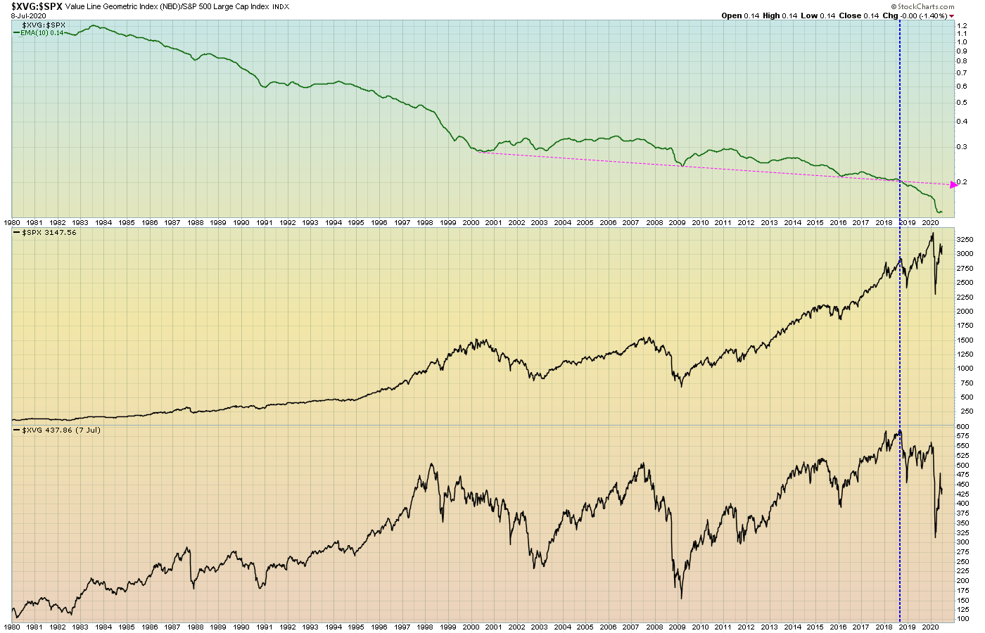
Let's start with a look at the stock indices, specifically long term breadth. Historically, analysts like to see broader measures outperform the narrower as a sign of underlying fundamental and technical strength. Here, we'll use the Value Line Geometric, NYSE Composite, Wilshire 5000 and Wilshire 4500 indices as the broad measures and the S&P 500 and Nasdaq 100 as the narrower.
The Value Line Geometric, an equal weighted index that uses a geometric average to produce a picture of the median stock price, has been in a long term secular decline relative to the SPX since the 1980's.
 Source: TheBullBear.com, Data from StockCharts.com
Note that after trending lower to sideways from 2000-2018, it then suddenly plunged sharply lower beginning with the October 2018 decline. This chart tends to suggest that market capitalization has tended to consistently concentrate away from the median stock into an increasingly narrower group since at least 1980.
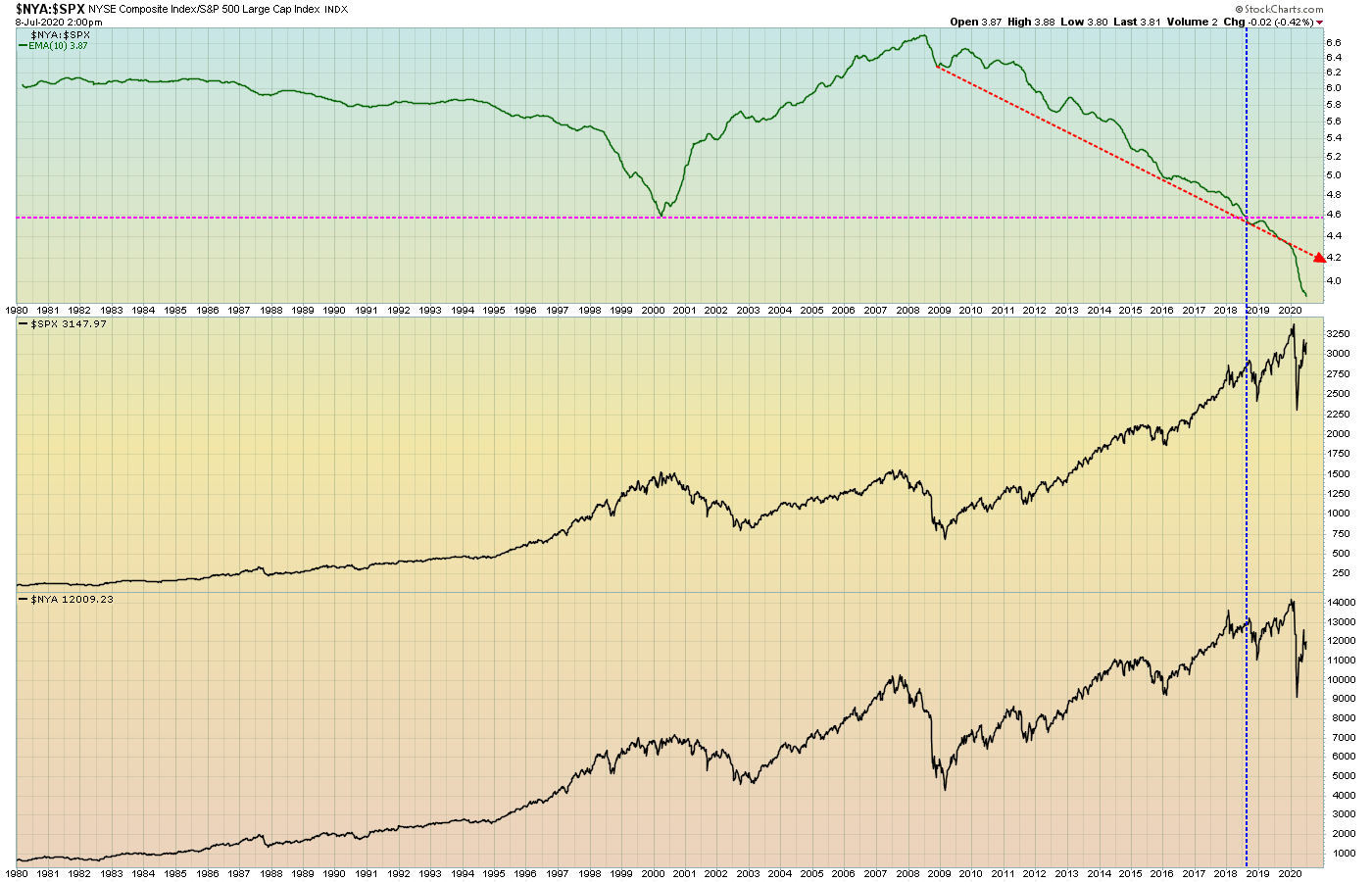
Here's the NYSE Composite of about 2000 issues relative to SPX 500:
Source: TheBullBear.com, Data from StockCharts.com
This ratio has been in decline since the 2009 financial crisis. It also plunged below its historical support beginning with the October 2018 selloff.
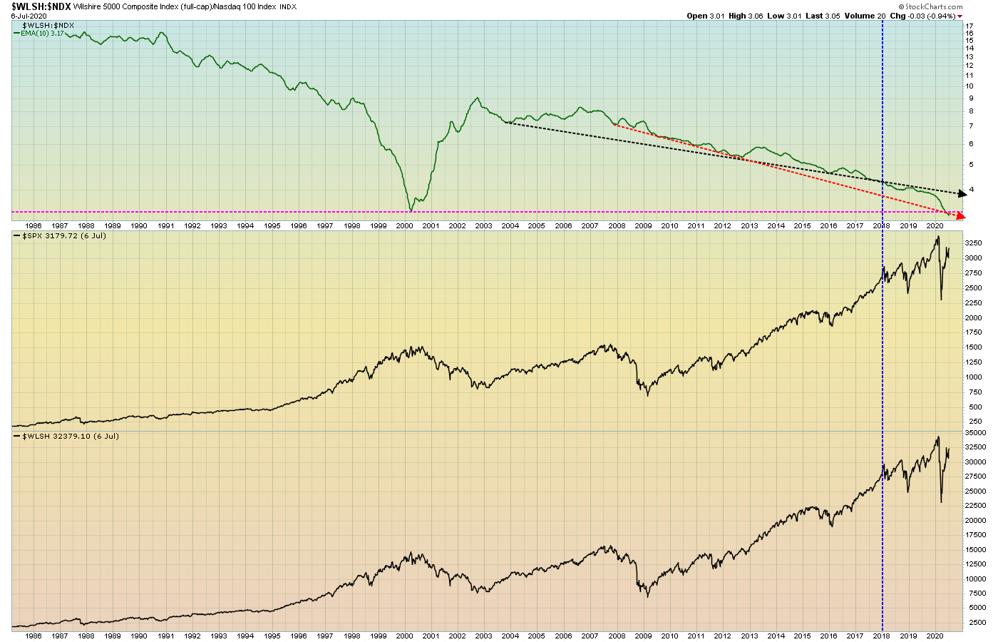
Now the Wilshire 5000 Total Market relative to SPX:
 Source: TheBullBear.com, Data from StockCharts.com
This ratio has been falling since 2014. It accelerated to the lower rail of its descending trend channel beginning in October 2018, and in 2020 it tested the bottom rail. A break through that support is possible soon. The rally in the ratio off the low has been very weak.
Now let's have a look at how the Nasdaq 100 index of technology stocks has fared relative to broader indices.
Wilshire 5000 vs. Nasdaq 100:
Source: TheBullBear.com, Data from StockCharts.com
This ratio has been in a secular decline since the 1980's, with a period of outperformance by the broad market only during the tech bubble crash of 2000-2003. The secular decline from 2003 began to accelerate in 2018 and crashed even more in 2020, with the 2000 low now taken out.
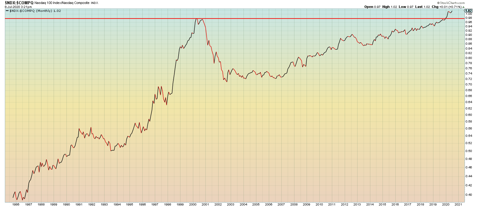
This action is confirmed by a concomitant acceleration and break above the 2000 high by the Nasdaq 100 to Nasdaq Composite ratio.
 Source: TheBullBear.com, Data from StockCharts.com
Let's say that the Wilshire 4500 (Total Market excluding the S&P 500) represents the traditional, productive, national economy of smaller producers. That part of the economy, at least as represented by its market capitalization, has been in secular decline relative to the tech stocks as represented by NDX.

Source: TheBullBear.com, Data from StockCharts.com
There was a sharp break of support and an acceleration beginning in 2019.
As of May 2020, the 5 largest stocks in the SPX, all tech stocks, were valued at almost 23% of the index total capitalization, the highest weighting ever by far.

Source: Bank of America, Data from Bloomberg
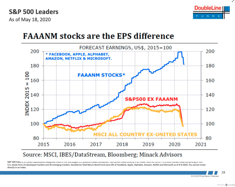
The six biggest stocks, all technology companies, have accounted for virtually all of the gains in the SPX since 2015 and have outperformed the rest of the index by 300%. SPX excluding these stocks is almost flat since 2015.
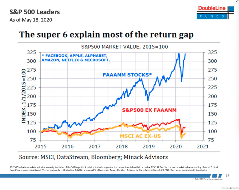 Source: Minack Advisors, Data from MSCI, DataStream, Bloomberg
As of June 26, the Big Five had risen 23% year to date while the SPX had declined -3%. Backing out these companies from the SPX, the index had declined by -8% YTD.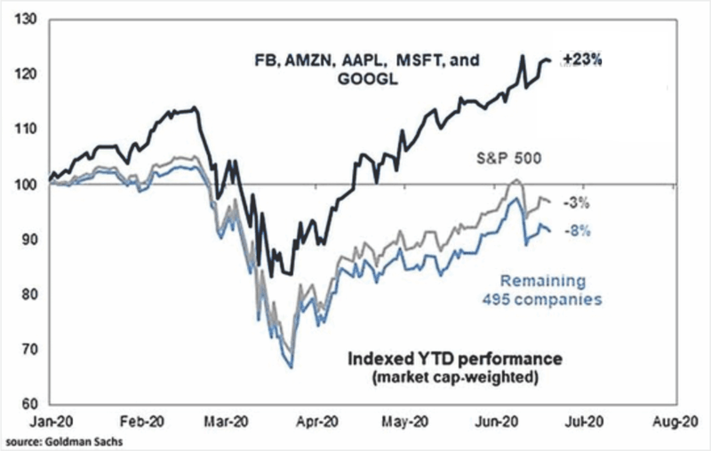
Source: Goldman Sachs
The spread between Global Growth stocks (generally technology issues) and Global Value stocks has never been wider and is accelerating fast.
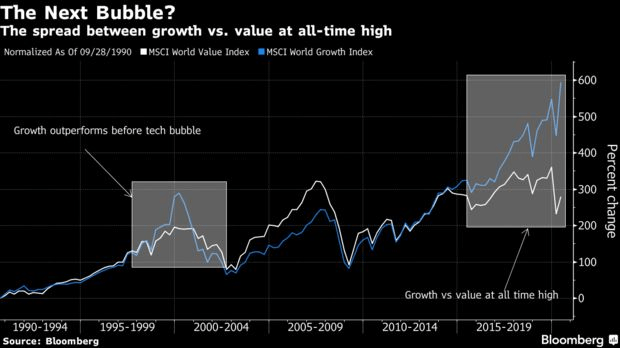
Source: Bloomberg
To summarize the above data, there has been a long term secular trend towards a concentration of market capitalization in fewer and fewer stocks over time going back to at least the 1980's. This trend tended to accelerate at certain market turning points with significant breaks occurring in 2018, 2019 and 2020. Within the larger trend towards market concentration, the movement was overwhelmingly focused on technology stocks and more recently a tiny coterie of megacap issues within that group.
Very often, when a downtrend, such as that seen on these ratio charts, is broken sharply to the downside, it represents a capitulation that results in an exhaustion and reversal of the trend. My take is that these breaks are marking a secular shift, not a trend reversal.
Generally, most market analysts would view such an accelerated narrowness of capitalization as a warning sign of an unsustainable bubble that will inevitably implode with disastrous consequences. I do not.
I think what we are going to find is that these charts are characterizing a fundamental, long term secular systemic shift to what I have called the "Information-centric economy". In my opinion there is as yet a vast under-appreciation and indeed an almost total absence of acknowledgement for the epic nature of this shift. That is the story that the above charts are trying to tell.
Earnings and ProfitsCorporate earnings and profits are of course another well-recognized metric of performance that all analysts and economists reference.
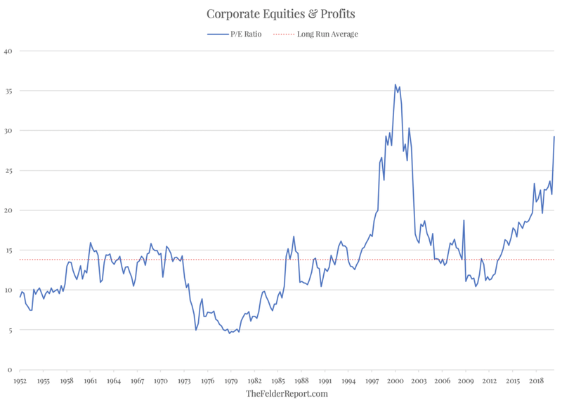
Corporate profits have been flat to lower since 2012 but equity price has soared.

Source: TheFelderReport.com
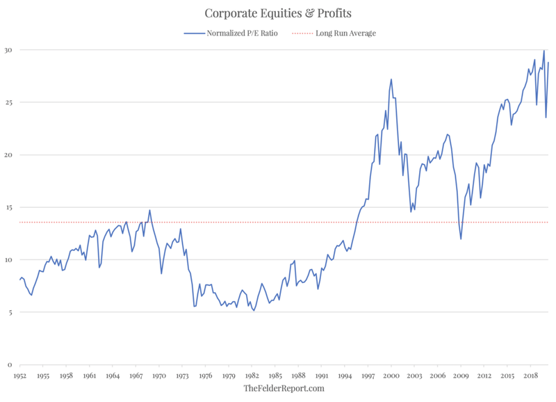
The Price/Earnings ratio has only been higher at the 2000 bubble peak, unless it is normalized, in which case it is well into all-time high territory.
Source: TheFelderReport.com
Source: TheFelderReport.com
The earnings of the Big Six tech companies are responsible for all of the earnings of the SPX since 2015. SPX earnings excluding those companies are flat.
Note that these measures departed from the long run average during the bubble run of the late 90's and only corrected back to about the area of the long run average in 2009. It appears that PE has found a "new normal" by this valuation metric.
 Source: Minack Advisors, Data from MSCI, DataStream, Bloomberg
Earnings growth and Sales growth are dominated by the Nasdaq 100 followed by the megacaps in the S&P 100 with the SPX showing marked earnings growth decline and sales flat. Midcaps and Smallcaps are showing prodigious earnings growth decline as sales recede.
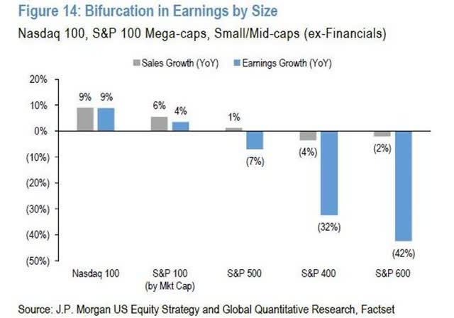
Source: J.P. Morgan US Equity Strategy and Global Quantitative Research, Factset
Since 2009, global technology earnings have crushed all other global stocks and that trend has accelerated sharply since 2018:
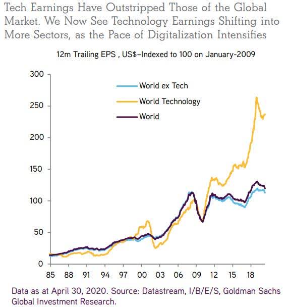
Source: Goldman Sachs Global Investment Research, Data from Datastream, I/B/E/S
SPX long term Earnings per Share Growth plunged starting in October 2018 while 12 month forward Price/Earnings ratio has soared:
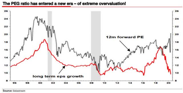
Source: Datastream
The Price to Earnings Growth PEG ratio has smashed through its long term upper bound and accelerated in 2020:
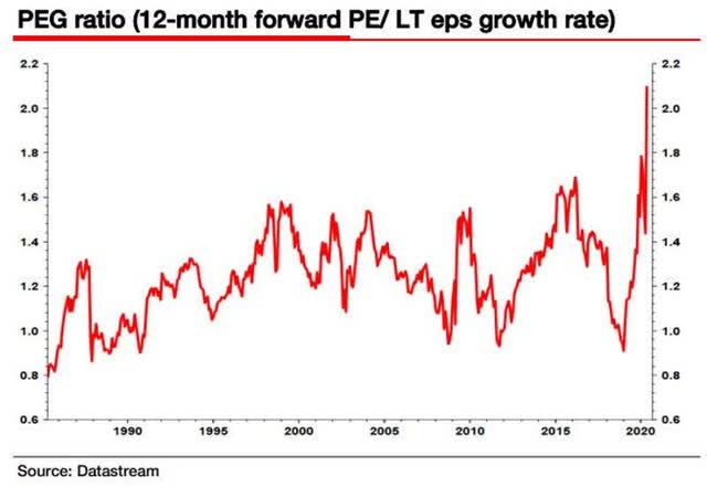
Source: Datastream
From this data we can conclude that the concentration of market capitalization in fewer and fewer stocks and specifically in the technology sector is supported and confirmed by secular trends in earnings which have accelerated in concert with trends in the stock indices. Most analysts view this data as a definite indication of extreme overvaluation and the harbinger of a catastrophic reversion to the mean. I do not. This data is telling us that, in essence, the narrow group of tech companies is, in essence, the economy going forward. The exploding PEG ratio indicates a shift into a radically different "New Normal" which has yet to be defined and described by economists and analysts. This will probably involve a radical shift in how "earnings" are defined and derived.
TreasuriesNow let's have a look at U.S. Treasuries. Early in the Covidcrash of 2020 I noted that the Treasury Yields/SPX ratios were breaking down from long term declining channels, signaling the onset of a Secular Shift.
Here's the long term weekly price of the 30 Year Treasury bond:
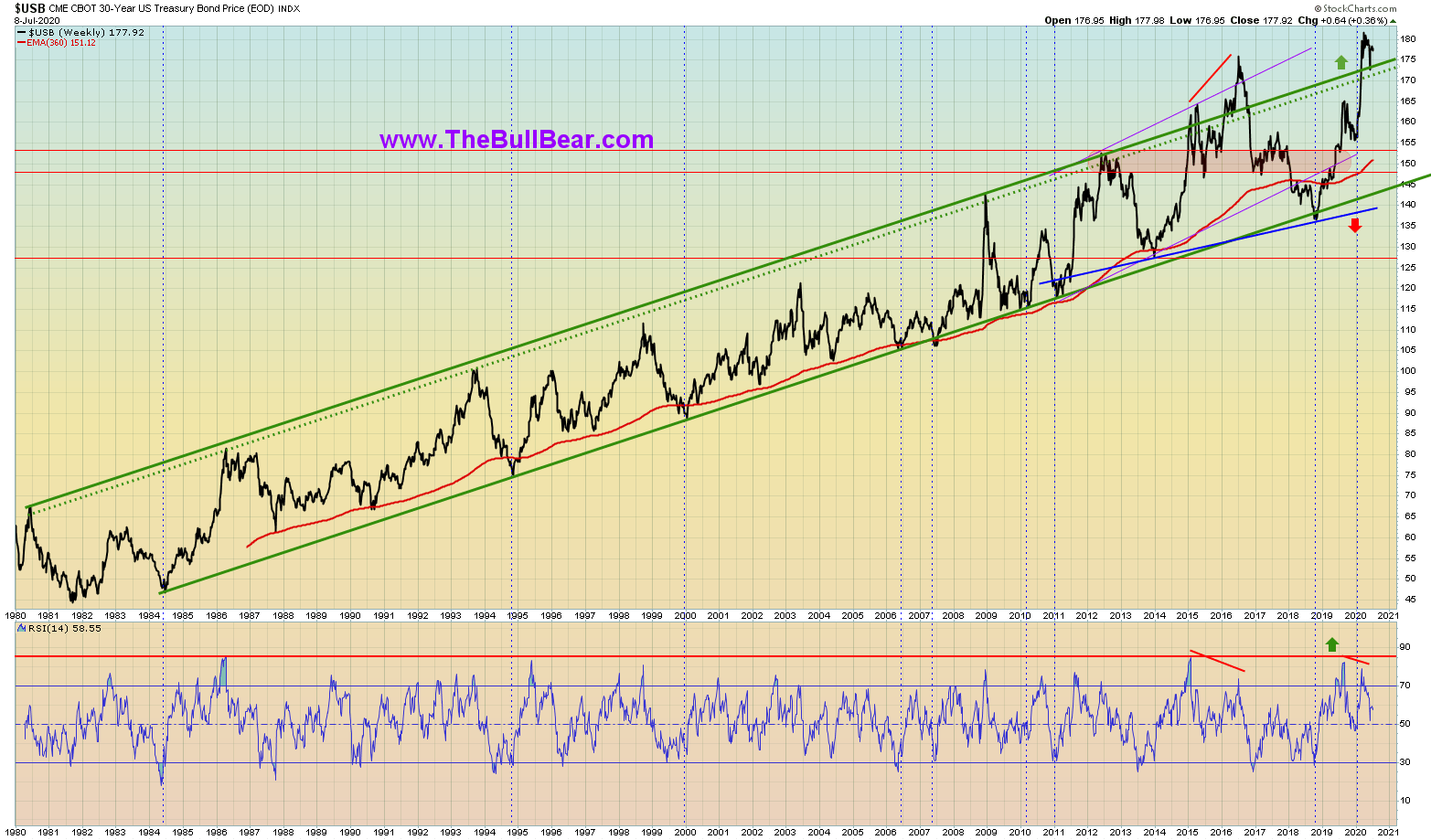
Source: TheBullBear.com, Data from StockCharts.com
The market saw a steady, long term trend channel since 1980 with strict adherence to the red 360 week EMA. After breaking the upper bound of the trend channel to the upside in 2016, it put in a large weekly bear RSI divergence and then abruptly failed back dramatically to break the moving average and the lower bound of the channel. Under most circumstances this action would be the technical signal for a dramatic long term trend reversal. Instead, the 30 Year charged back into the channel, through the EMA and has broken the upper band of the channel once again, to new all-time highs. This strongly suggests that the prior trend is ending not with a breakdown but with a breakout, establishing a new long term uptrend. The suggestion is that Fed monetization of Treasuries is permanent and negative yields are likely.
The relationship between the 30 Year Treasury Yield and the price of SPX confirms this conclusion:
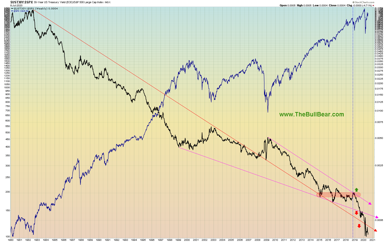
Source: TheBullBear.com, Data from StockCharts.com
The very long term downtrend in the ratio appeared ready to break out to the upside in October 2018 (once again, that same inflection point keeps appearing) but instead plunged lower through trendline and price support levels and has continued to fall. Again, in many circumstances this would be a capitulation move setting up a reversion or an outright trend reversal. In this case, however, it much more likely marks a secular, systemic shift.
In connection to the above, we will now examine the relationship between the S&P 500 Dividend Yield and the Yield on long dated Treasuries. This is a metric that economists and market analysts have long regarded as highly important.
The dividend yield on the SPX is not far from the all-time low seen in 2000.

Source: Robert Shiller
While absolutely low on a historical basis, SPX Yield is at the same time at all-time highs relative to 10-year Treasury yields:
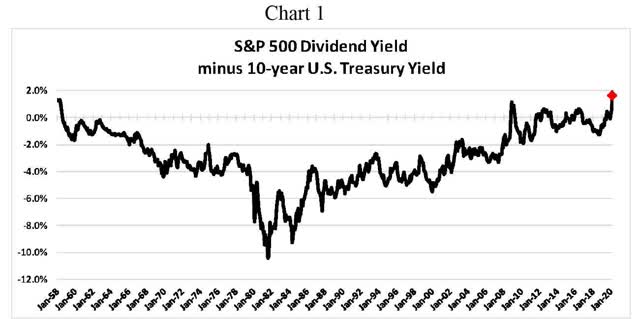
Therefore, in spite of the index price being near its all-time, stocks have never been this attractive relative to the yield on the 10-year.
Source: Leuthold Group

Source: Bank of America US Equity & Quant Strategy, Data from S&P
Note the unprecedented explosion of the ratio, signaling secular systemic shift.
The 200 week EMA of the SPX Yield-10 Year Treasury Yield spread appeared to break down from its long term uptrend in 2018, but like the 30-year price, it recovered and rallied to new all-time highs:
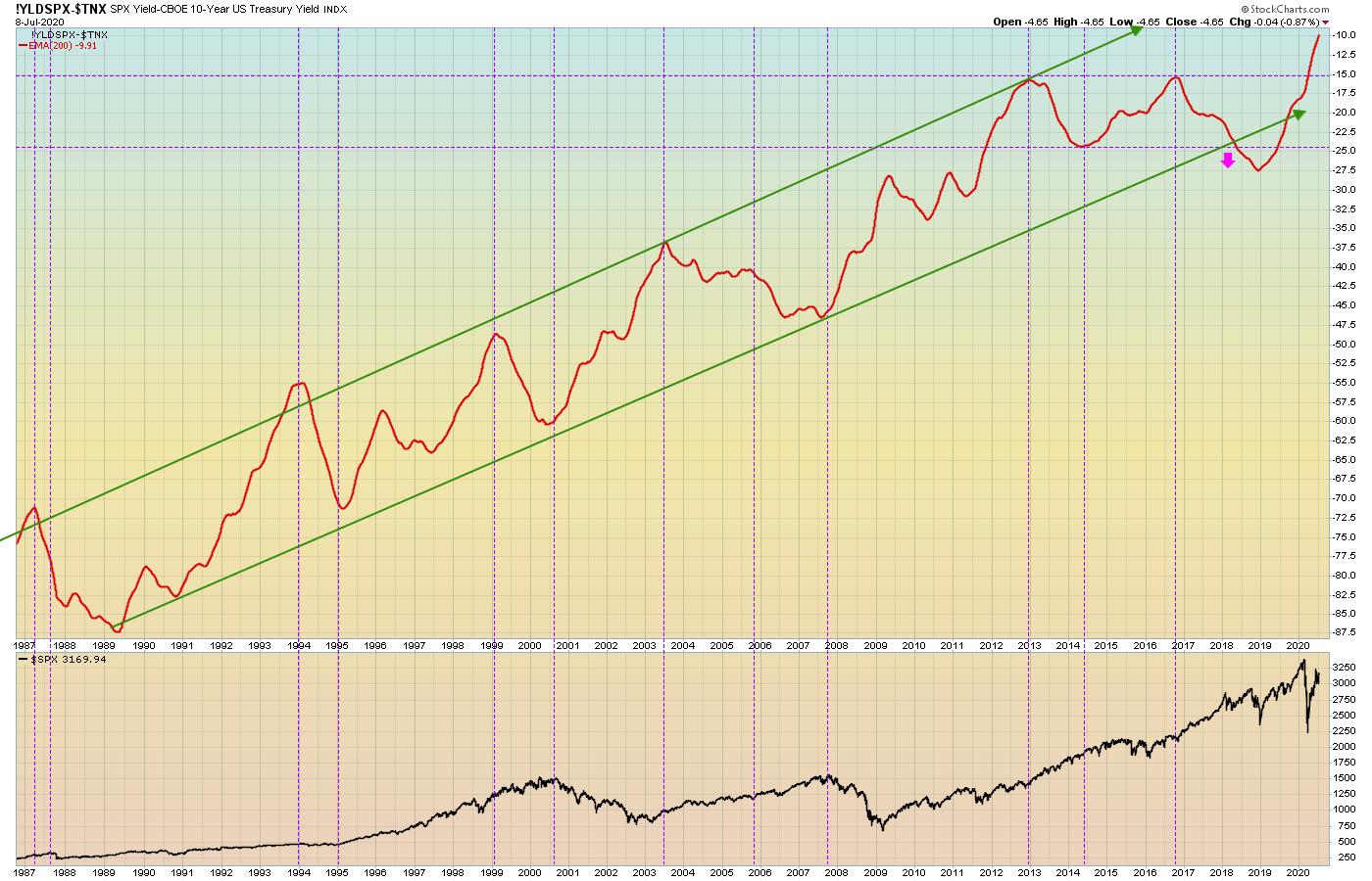
Source: TheBullBear.com, Data from StockCharts.com
Once again, a failed long term trend break resulting in a new long term uptrend.
From this set of data we can conclude that, concomitant with the shattering of long term trends in stock index breadth and earnings via dramatic trend acceleration, we have seen the same action in Treasury yields and the relationships between Treasuries and stocks and stock yields. The inflection points of all of these data sets also tend to align very well.
ConclusionsThe data included herein, as well as that which is forthcoming in future installments of this series, shows that something is "broke". There is a discontinuity with the past, but in an unexpected and generally misunderstood direction. Most analysts will view this data and expect an economic and financial system result that aligns with past episodes such 1929, 1974, 2000 or 2007. My analysis is that looking backwards for models of what to expect from the current conditions is an error.
The data is telling us that we are either well along in the process of transitioning to (or already in) a new secular systemic economic and financial system paradigm. Models of the past paradigm will not be applicable. Analytical tools and metrics of the past paradigm will not be useful. In fact, continued adherence to past models, tools and metrics will actually prove to be an absolute detriment to those seeking to understand present and future conditions. The data demands a new theoretical framework and that new models, tools and metrics are absolutely required.
My concerted opinion is that the Secular Systemic Shift now underway is so profound and so far-reaching and so all-encompassing that it is probably analogous to the shift occasioned by the Age of Enlightenment, the Scientific Revolution, the American Revolution and (later) the Industrial Revolution. The current Revolution is not merely Economic, but rather extends into every facet of human activity and thought. At its core is the catalyzing, transformative force of Information Theory.
We will forge forward along these lines in future installments. The next essay will cover:
- Debt
- Corporate Debt
- Debt to GDP
- Employment
- Federal Reserve Balance Sheet
- Fed Funds
- Velocity of Money
- Stock Buybacks and Insiders
- Economic Maldistribution
- Entitlements
This series is tackling material that will eventually require a book to give it adequate treatment, and so represents a necessarily compressed formatting.
FOR MORE: WWW.THEBULLBEAR.COM