THE CYCLES
It is difficult to convey to the average investor the potential hardships he or she will face over the next 5-10 years or longer. The total return from an average stock market investment over the past 75 years has been approximately 10% per year on a compounded annual growth rate basis. Over the past 30 years, from December 1974 through December 2004, the total return has been a fabulous 13 3/4% on a compound annual growth basis. Those rates of return are based on total return data for the S&P Composite Index. The difference between total return and the return you might calculate by simply using the closing price of the S&P Composite Index is that the total return figures include dividends. We believe the concept we are about to discuss is so important to long-term investing that we will change the typical format of our newsletter this month to accommodate some excellent explanations of expected total return from two analysts who have provided lucid explanations on the subject. We believe these discussions are valuable because they turn out to be another way of explaining how historically overvalued current stock prices are. The first commentary we will quote from was referred to us by John Mauldins excellent weekly commentary entitled Outside The Box. The commentary was written by Ed Easterling, author of a book entitled, Unexpected Returns: Understanding Secular Stock Market Cycles.
Easterling explains that the earliest baby boomers who are now beginning to retire will be relying upon their investments for income while the latest boomers will have two more decades to compound their savings. An expected 10% rate of return would mean both the young and the old boomers would have a good chance of a secure retirement. Beginning in 2005, what length of time would be needed to assure them the long-term average return? Easterling contends that investors from today will never achieve the long-term average return. Not in 10 years, and not even in the 79 years that represent the time span used to calculate the 10.4% compound annual growth rate noted above.
Easterling goes on to analyze the three components of total stock market returns: earnings growth, valuation-level changes as represented by changes in the p/e ratio, and dividend yields. The breakdown of the past 79 years shows that earnings growth contributed 5.0% to the total 10.4% return, the increase in the p/e ratio over that period provided 0.9% to long-term average, while the dividend yield contributed 4.5% to the total return. Without going into the detailed explanation of each of those components and why they will almost surely contribute significantly less to overall stock market returns into the future from current levels, we can tell you that Easterling concludes that is exactly what will occur. He reasons that earnings growth will be lower than average unless inflation increases, dividend yields will be well below average as a result of current valuation levels, and p/e ratios cannot contribute their past benefits due to their currently historically high levels. His final conclusion is that investors can expect that the long-term return based upon 2005 as the starting point will be less than two-thirds of the historical average. Once p/e ratios retreat to average levels, future longterm returns from that point will increase.
From now until then, investors would suffer the effects of a p/e decline and only when the starting point for the p/e ratio is around 10 or lower, as it was at the starting point from which the 75-80 year calculation of an average 10.4% return was calculated, can investors expect that the historical long-term average return will again be possible. If you seek an example where far lower than average returns were realized when calculated from a prior overvaluation point, we can report to you that the compound annual growth rate of the S&P composite total return for the 16 years between December 1965 and December 1981 was under 6%. Those of you that have our May 6th, 2005 newsletter should look at the page 4 chart of the ratio of price to 10 year earnings and relate it to the discussion above.

The next gentleman we would like to quote in the same vein is John Hussman who wrote an article entitled, The Likely Range of Market Returns in the Coming Decade.
Hussman shows a chart of annual peak to peak earnings growth and points out that analysts often point to earnings growth from a prior trough to a subsequent peak rather than the more logical peak to peak growth rate. His chart shows that earnings have shown a consistent 6% growth rate from peak to peak over the past 55 years. Once you have the concept that earnings have almost always grown at a rate of 5-6% as measured from peak to peak over the past century, you are ready to examine the multiples that the market assigns to those earnings which, in effect, is simply a reflection of market sentiment. These next two paragraphs, we believe, are of paramount importance and we will quote them from the Hussman article:
"Next, lets look at P/E multiples. I frequently present calculations of probable long-term stock returns by making a few assumptions about long-term peak-to-peak growth in earnings and various future P/E multiples. I generally base these P/ E ratios on peak-earnings. The price/peak-earnings multiple is the ratio of the S&P 500 to the highest level of earnings attained to date, even if current earnings on the index have declined below that peak. I constructed this in order to filter out the uninformative spike in the P/E ratio that occurs when earnings plunge during recessions. The price/peak earnings ratio is equal to the raw P/E when earnings are at a new high, as they are today, and is otherwise lower than the raw P/E. This makes it a conservative measure of market valuation, so very high levels properly merit concern.
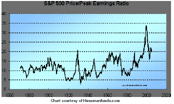
Based on newly released quarterly earnings figures, the S&P 500s price/peak earnings ratio is nearly 20. Consider that level from a long-term perspective. Except for the reckless and unsustainable valuations at the 2000 peak, the current multiple has been observed only at the 1929, 1972 and 1987 market extremes and at the late 1960s market extremes. While the market plunges beginning in 1929, 1972 and 1987 are wellknown, those mid-1960s valuations deserve some context as well. The Dow first approached 1000 in late 1965. It reached a durable low in 1982, seventeen years later, at 777 - a level it first achieved in January 1964. Investors forget these things if they ignore the data long enough.
This article is dated February 22nd, 2005. It should be easy to see from the chart that current valuations in relation to peak earnings are at their highest level of the past 130 years except for the preceding six-seven year period. If we assume the 6% peak to peak growth rate will continue as it has for thepast half century, then we can calculate what the total return will be over the next 10 years on investments from current levels once we set a target for a future price/peak earnings ratio. Hussman presents the formula to calculate these various rates of return. He finishes by writing:
At the markets actual 2000 peak, valuations were so high that even a future price/peak earnings ratio of 20 could have been expected to result in a nearly zero annualized returns over the following 10 years. Not surprisingly, in the 5 years since the 2000 market peak, the S&P 500 has actually produced a total return of about -2% annually. The likelihood is that the coming 5 years will not be substantially better.
Presently, the likely range of S&P 500 annual total returns for the coming decade is in the 2-3% range based on average and median scenarios, with outside possibilities as low as -3% in the very bearish case and still less than 8% in the very bullish case."

Even assigning a possible margin of error in Hussmans calculations and projections, it should be relatively easy to see that the next 10 years will present a very difficult and very different market atmosphere for investing than has been seen over prior 10 year periods. Mind you, Hussman's calculations give us a good idea what the possible ranges of prices will be 10 years from now. They give us no idea how we might get there.
For example, on an extreme basis, if prices were to decline 75% from current levels the 10 year outlook from that point could present outstanding long-term opportunity and perhaps hold out the promise of 10 year projected returns in the 10+% range that investors have come to expect as their birthright. The bottom line, of course is that it has never paid to be invested or get invested for the long term when valuations are as high as they are currently. The promise of great long-term returns will resume once price/ peak earnings returns to value levels between 5-10. That will be a painful journey to travel but somehow, the market will get there. It always has in the past. We hope to keep subscribers off that train ride.
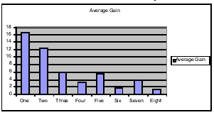
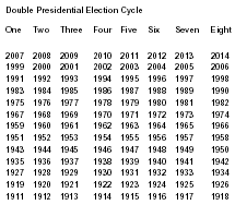
In our continuing research of seasonality patterns in the market, we were led by Roger Schreiner of Schreiner Capital Management to an article entitled The Eight-Year Presidential Election Pattern written by Adam White for the November 1994 issue of Technical Analysis of Stocks & Commodities. Most market analysts, be they technical or fundamental, are aware of the so-called presidential election cycle. The pattern suggests that the two years leading up to a presidential election are generally better years for investing than the two years that follow. Adam White studied the year to year changes in the Dow Jones Industrial Average through election cycles from 1912 through 1992 (remember this article was written in 1994). He found, on average, that pre-election years (2003 would have been the most recent In the current pattern) were + 11.0%, election years were + 7.0%, post-election years were +4.7, and mid-term years were + 2.3%. Mr. White notes that the average return of each type of year is what might be expected. The pre-election and election years are indeed more attractive on average for investors than the post-election and mid-term years are. That type of analysis had been done before. What distinguished Whites analysis was that he went on and examined what he called an 8 year presidential election pattern. He discovered that if he numbered the first pre-election year beginning with the year 1911 as Year 1 within the eight year pattern, the resulting returns showed a significant pattern.

As you can see from the above data, years 1-4 within the pattern are significantly stronger than their corresponding years 5-8. Not only that, but the first pre-election year (Year 1) is stronger than the second pre-election year (year 5), the first election year (Year 2) is stronger than the second election year (Year 6), and so on down the line. Each year in the grouping of the first four years is stronger, on average, than its corresponding year in the grouping of the second four years. This chart and table should prove useful to anyone who does long-term investing based on seasonality. It just so happens that it fits in nicely with the longer term cycles discussed in our August newsletter. You would do well to emember that these are simply average performances and there will, of course, be years in the future that do not conform to the above pattern. With that in mind, however, we should point out that the year 2006 lines up with year number 8 in the above pattern and is scheduled to be the weakest of all the years within the pattern. The year 2007, on the other hand, is scheduled to be the strongest year within the eight year pattern. We suggested in our August newsletter that in the past, if the four year cycle bottom (due in 2006) and the 25 year cycle bottom (due in 2007) had different resolutions, it was the 25 year cycle that ruled.
In fact, the 25 year cycle argues that there will be no important bottom in the year 2006 nless it occurs very late in the year and joins forces with a very early 2007 resolution of the 25 year cycle bottom. What the election year patterns cannot tell us is how vulnerable the market will be between now and the resolution of next years four year cycle and the 25 year cycle bottom due in 2007. We believe the potential vulnerability is great.
TECHNICAL INDICATORS
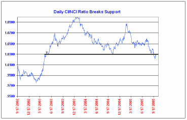
In our last newsletter dated September 2nd, 2005, we showed a chart of the CI/NCI ratio and noted that a convincing break below the lows established around 1.030 would present a longer term pattern of a high below a previous high and a low below a previous low. We went on to say that all of that could be happening even as the daily advance decline ratio is only one month away from its recent high. As you can see from the chart below, that support line has now been convincingly penetrated and there is an obvious longer term pattern going back two years showing both a lower high and a lower low. That pattern has been setting up even as the advance/decline line went to new alltime highs and the advance/decline ratio moved to a multi decade high.
As the S&P 500 was making a new high for the year on August 3rd, the CI/NCI ratio was at a reading of 1.053. The markets upside momentum had faded dramatically from the 1.088 reading seen on Valentines Day of this year. We were finally seeing a reading that was very much into the type of overbought territory that often accompanies an important market high, and yet not so high as to suggest it might only be an internal market top with higher prices to come in the popular averages. That is the conclusion that is normally drawn with readings above 1.07 and 1.08 on the CI/NCI ratio. Because we have seen such a great loss of upside momentum accompanied by a bearish pattern of lower highs and lower lows on the CI/NCI ratio, that ratio is now speaking with a bearish voice for the first time in a very long time. The ratio is not always useful in identifying intermediate-term market bottoms, but usually such bottoms do not occur until the ratio has fallen below a neutral 1.000 level.

On our daily update of September 21st, we mentioned a technical indicator that we have discussed before in these pages. Here is what we said:
"On our update of September 16th, we discussed an indicator called the Hindenburg omen in anticipation of a possible signal from that indicator. Our old buddy, Kennedy Gammage, a canny and wise geezer who has recently retired from the newsletter business brought this indicator to our attention and the attention of his subscribers many years ago. It was devised by Jim Miekka, a gentleman who corresponded with Kennedy When I first heard of the indicator, the requirement was stated to me that if the lesser of 52 week highs and 52 week lows on the New York Stock Exchange on a daily basis was greater than 2.4%, then a Hindenburg signal had been generated. We later saw the 2.4% figure decrease to 2.2% and a few filters were added such as the position of the McClellan Oscillator and the 10 week moving average of the Dow.
In any event, those of you who have read Stock Market Logic, a classic stock market book which we highly recommend, will recognize the indicator as an offshoot of the
High Low Logic indicator devised by Norman Fosback, the author of Stock Market Logic. The rationale behind the indicatoris that, under normal conditions, either a substantial number of stocks establish new annual highs or a large number set new lows- but not both. As the Logic Index is the lesser of the two percentages, high readings are therefore difficult to achieve. When the index attains a high level, it indicates that the market is undergoing a period of extreme divergence- many stocks establishing new highs and many setting new lows as well. Such divergence is not usually conducive to future rising stock prices. A healthy market requires some semblance of internal uniformity, and it doesnt matter what direction that uniformity takes. Many new highs and very few lows is obviously bullish, but so is a great many new lows accompanied by few or no new highs. This is the condition that leads to important market bottoms.
That is the logic behind the Fosback indicator. Inasmuch as his book was written in 1976, we assume that it could well have been the basis for the Hindenburg Omen. In any event, the lesser of 52 week highs and lows today was a very high 4.0%. That qualifies as a signal regardless of whether you use 2.2% or 2.4%. Some very sharp market declines have followed such signals in the past, but we emphasize it is not a perfect indicator (does anyone know what is?).
Several Hindenburg omen signals have been given over the past two weeks. Such signals often precede accelerated market declines and/or crash-like behavior. We should also note that the Fosback daily High Low Logic Index 10 day moving average also reached into territory where the average market behavior following such readings is negative for at least the next month.
MARKET PROJECTIONS
On the weekly projection charts as of the close on Friday, October 7th, the Dow Jones Industrial Average had generated a nominal 40 week downside projection to 10,027 ± 70 points. The implication from that projection is that there are at least another 100-200 Dow points to go on the downside from this weeks low of 10,218. The S&P 500 was very close to giving at least a preliminary nominal 40 week downside projection to around 1140-1145. That projection was not given by the close of the market today, but any daily close below 1190 next week on the S&P 500 Composite Index would generate at least a preliminary downside projection to around that price area. The Nasdaq Composite also suggests there is further to go to the downside with a confirmed 20 week projection down to at least 2059. The lower window of that projection is right around the 2000 level.
MUTUAL FUNDS
Rydex switchers saw plenty of activity this past month. On our daily update and mutual-fund update dated September 12th we recommended the purchase of the Rydex Tempest Fund at the morning pricing on Tuesday September 13th (Rydex Dynamic funds are priced at 10:45 a.m. Eastern time and closing time at 4:00 p.m. Eastern time). We purchased the Tempest Fund at the morning price of 40.65. On September 30th, we did a special update before 3:20 p.m. Eastern time recommending the sale of the Tempest Fund at the close that day. The fund was sold at 41.17 for a profit of 1.3% on the trade. On October 4th, our daily update and mutual-fund update recommended the purchase of the Rydex Tempest Fund at the morning pricing on October 5th. We bought the fund at 42.44 and that is our current position. Rydex switchers are in the Rydex Tempest Fund.
Fidelity Select switchers are in 100% cash positions. We continue to have a great success in the trading of our seasonality program with accounts up 16% since February 24th. The S&P 500 index is down 0.4% over that same period of time.
We have two different specific model portfolios-one for Fidelity select switchers and one for Rydex group switchers. How you distribute your own portfolio is up to you as an individual.
Stockmarket Cycles is published the first Friday of the month by Peter G. Eliades. Information is gathered as carefully as possible, but no guarantee can be made as to the accuracy of text or charts. The analysis of stock market cycles is more an art than a science. No guarantee can be made that recommendations will be profitable or will not result in losses. This subscription will not be reassigned without the consent of the subscriber. All information contained herein and given on the telephone update may not be reproduced or rebroadcast in any form whatsoever without the written consent of Peter G. Eliades.
1 year (12 issues) letters only $252.00
6 months (6 issues) with daily telephone update $261.00
1 year (12 issues) with daily telephone update $480.00
2 issue trial with daily telephone update $98.00
.
Next Publication Date: November 4, 2005


