

NO SIGNIFICANT TOP FOR A NUMBER OF MONTHS
Long term subscribers have long heard us fulminate against looking at the economy as a guide to the stock market. The market leads the economy, not vice versa so why anyone would want to look at a lagging indicator is beyond us. Yet, commentators do it every day on various financial news outlets.
The same is true for earnings. Yes, earnings are going to be the ultimate determinant of stock prices. IBM isn't going to earn $100 per share and sell for 50 cents a share.
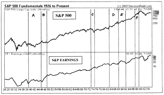
But there are periods when earnings and stock prices part company for years at a time. Look at the chart below which is courtesy of Decisionpoint.com.
We have depicted periods, designated by letters of the alphabet when stock prices did not do what the earnings would have suggested. Look at period "A" from 1939 to 1946. During the first half of this time span, earnings went up and stocks went down. Then in the second half, the opposite was true. Sector "B" from 1946 to 1949 saw a surge in earnings and a stock market that was flat to down. Sector "C" from 1973 to 1975 had earnings surging and the stock market crashing. In 1976, the opposite was true. We had a nice run in stocks from 1983 to --- 1988 designated by sector "D" and yet earnings were lackluster. The same thing happened in sector "E" from 1988 to 1992. And again in time sector "F" from 1997 to 1999.
Have you noticed that the latest, almost spectacular rise in earnings haven't given us much in stock price movements?
Yet, we have heard a number of high priced analysts suggesting that the second half of the year may bring a slowdown in earnings growth and therefore, impact the stock market, as if there was some sort of lock step relationship.
Why are we dwelling on this? Because looking at the wrong thing can be detrimental to your financial health. If you had known, for instance, that earnings would surge in 1974, you might have bought stocks only to see prices drop as much as 80%.
So what does work? Primary among all indicators we look at is liquidity. When there is a lot of money on the sidelines, a lot of it will eventually go into stocks. We showed a chart of liquidity in the newsletter for February of this year. We have heard estimates as high as $9 trillion for short term instruments.
MORE MARKET ANALYSIS
According to research by Ned Riley of Ned Riley and Associates, there are $6.6 trillion in money market funds held by the public. Just to put that into perspective, every home in the United States combined is worth about $16 trillion.
Of course, there is no law that says this money has to come into the stock market, but history says that a substantial amount will do just that.
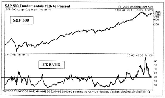
Getting back to the subject of earnings and stocks, the chart below, also courtesy of Decisionpoint.com, shows the history of the put call ratio. For decades, a price multiple of 20 seemed to mark a peak for stocks, but after 1992, that kind of thinking would have caused you to miss a major portion of one of history's greatest uptrends.
We might also note that the current bull market started in late 2002, when the p.e. ratio was up around 30. This is why you have to look at everything, not just one indicator. In my newsletter of December 2002, I said that a new bull market had begun even though I was well aware of the price multiple at that time.
What may have happened is that memories of the great depression have slowly faded and investors have been willing to bid up shares. I remember in the 1950s, there were public service advertisements telling people to not worry about the return of the depression. Obviously, there was a lot of concern even then. By 1990, the great majority of those who had a living memory of this financial tragedy had passed away.
A HOUSING BUBBLE?
Normally, we don't stray too far from the stock market, but since this is an investment newsletter, we will pass along some interesting tid bits about the housing market from time to time.
We don't place a lot of store in the pontifications of economists, but if one of their number says something provocative, we will listen. Regarding the potential drop in housing prices, David Berson, the chief economist with Fannie Mae said that in the past, house prices had only gone down in conjunction with a recession.
We looked at the last time housing prices dipped in the early 1990s and sure enough, there was a recession in 1990. In that regard, we also take note that too many people are talking about a bubble in residential real estate. If this is like other markets, it's unlikely that a top will occur with everyone talking about it.
Before we leave the subject of earnings, the economy and the stock market, we would like to quote the Wall Street Journal from this past Friday regarding European stocks for the first six months of 2005. " .France's CAC-40 rallied 10.7%. Germany's Xetra-DAX climbed 7.8% and Britain's FTSE-100 stock index rose 6.2%, measured in local currency. Not bad for a region plagued with low economic growth, weak domestic demand, high unemployment, bitter political squabbling "
These markets are at multi year highs in spite of economies that are less than spectacular. If you want to study the market, don't study the economy.
BONDS AND SENTIMENT
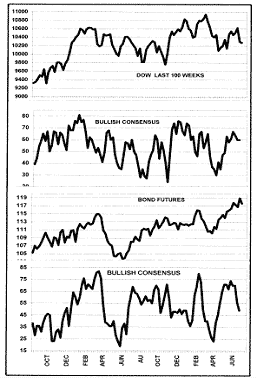
The Bullish Consensus is a survey by Consensus Inc of Kansas City MO. It tallies the sentiment of analysts and newsletter writers and like any crowd, they tend to be wrong at extremes. The second chart below monitors stocks, while the fourth chart monitors the bond market.
In the last issue, we noted that the oversold condition for the Bullish Consensus for stocks became oversold in early April and that the rally we got was somewhat restrained. We suggested that we might be owed more on the upside. That is still the way we feel. Since then, the market has actually gone down. The consensus is still not strongly overbought so it would appear that we can get a bit more on the upside from the present configuration.
The Consensus for bonds, on the other hand, has been very overbought and is now curling over. This gauge is suggesting a top of sorts for the bond market.
OTHER MARKETS
We are currently bearish on gold. We have been in this posture since the close of April 14 of this year.
We are bullish on the greenback and bearish on the Euro. This has been the case since the close on March 22 of this year..
We remain bullish on Treasury Bonds which is where we have been since the close on April 11 of this year.
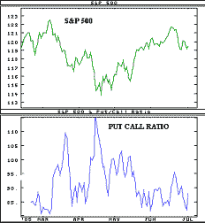
PUT CALL RATIO
The put call ratio, by recent standards, would appear to be bearish. However, there was a time when any reading over .80 for the five day moving average would have been considered bullish.
Bear in mind that these indicators are almost universally better at picking bottoms than tops. Note that the surges above the 1.0 level gave us an uptrend while the visits to the lower end of the chart didn't necessarily result in a selloff.
NEWS AND THE MARKET
(1) On Jan. 21, the Michigan sentiment survey was lower than expected. (2) On Feb. 16, Greenspan suggested that the economy was good with low inflation. (3) On Feb. 22, Korea supposedly said that they wanted to diversify from dollars and oil was up over 5%. (4) On March 8, It was reported from the floor of the NYSE by CNBC reporter Bob Pisani that floor traders weren't worried about the market.. (5) On March 17, the market tried to rally, but a surge in oil retarded things. (6) On March 29, the Dow dropped 80 points for no particular reason. (7) On April 7, Crude oil dropped 3%. (8) On April 15, IBM reported poor earnings and there was a slew of poor economic news. (9) On April 21, the Dow rallied 206 points on great earnings news and solid economic reports. (10) On May 9, the market rallied sharply, most likely in a delayed reaction to the unemployment numbers released the day before. (11) On May 13, the Michigan sentiment numbers were lower than expected and dropped for the fifth month in a row. (12). On June 3rd, the unemployment statistics were much worse than expected and this caused a solid market decline. (13) On June 16, the Dow surged to a new rally high on quadruple witching day. (14) On June 23, the market plunged 166 points after oil hit $60 for the first time. (15) On June 30, the market dropped in disappointment that the Fed again raised rates without hinting when they might end the increases.
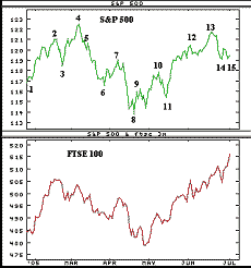
THE LONDON MARKET
London stocks are certainly doing better than their U.S. counterparts. This is a good looking chart pattern.
Sometimes, we lead them and sometimes it's the reverse. This time, we would estimate that they are leading us because what you see in this chart is also reflected in the German, French and other stock markets.
NOVA URSA RATIO
The ratio of Nova (bullish funds) to Ursa (bearish funds) continues to show bearishness and this should be a positive.
We have had a pretty good uptrend since early April, but the Rydex switch fund managers have been somewhat reluctant to join the rally, electing instead to remain in the bearish funds.
This fits in with our expectation of higher stock prices in the months ahead. Again, we like this indicator because, unlike surveys, it says what investors are actually doing with their money.
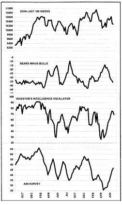
The Dow has recently rebounded from its downtrend, but the chart pattern isn't saying much. Basically, waffling around.
Sentiment, as measured by Investors Intelligence is showing relative bullishness. This is a negative.
The Investors Intelligence Oscillator, which measures the percentage of NYSE stocks above their own 10 week m.a. is turning down from an overbought condition which is bearish.
The American Association of Individual Investors survey is now neutral after having been very oversold.
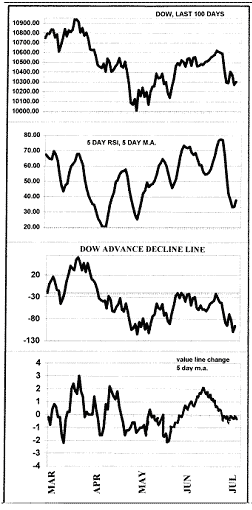
The Dow has pulled back about half way of the recent rally. This is frequently a buy point.
The five day m.a. of five day RSI is curling up from an oversold condition. This is a positive sign.
The Dow advance decline line has been weaker than the index which tends to be a negative.
The Value Line net change five day moving average is basically in a neutral condition at the present time.
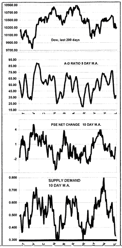
The Dow has retraced about 50% of the recent rally. Frequently, this constitutes a bottom.
The advance decline ratio is now in a mildly oversold condition and this should be a positive.
The PSE net change 10 day m.a., has just turned up from a mildly oversold condition.
The Supply Demand 10 day m.a. is currently very oversold and should be a positive for the stock market.
TRACK RECORD AND OTHER CONSIDERATIONS
We did not make any short term ETF trades during the month just past. We should have, but the sharp rise in crude oil made us back away. As it turned out, the stock market ignored crude for the most part.
THE YIELD CURVE
In recent weeks, much has been made of the flattening yield curve, but just what is a yield curve and why should we care?
A normal yield curve is one in which short term rates are lower than long term rates. Typically, investors who invest in 30 year bonds will want higher rates for tying their money up for that long a period with all the inflation potential.
A flat yield curve is one in which long term rates are the same as short term returns. Rarely, we see a condition in which short term rates are actually higher than those of the long term. When this happens, it's usually because the Fed has been aggressive in raising the only rates that they control. This is the rate for Federal Funds or more rarely, the Discount Rate.
During the 1970s, the Federal Reserve under Paul Volker raised short term rates to the low teens in the mistaken belief that this would stop inflation. Instead, it made it worse. Most economists still don't understand this, but many businesses depend on short term borrowing and when this cost of doing business increases, they have to raise prices or have their profits cut severely.
Market forces control long term rates and when these rates are lower than short term rates, it is a sign that the Fed is being aggressive and the economy suffers as a result. The only reason that the negative yield curve has been associated with recessions is that banks are forced to borrow short and lend long. Obviously, this makes them vulnerable.
For the most part however, the operative part of the equation is high short term rates. The yield curve per se is really not a factor. Some say that lower long term rates means that the economy is weakening. Wrong again. Long term rates have been in a steady downtrend since early 1982. This is a twenty three year secular bull and during that time, the economy has done just fine for the most part.
The absolute level of rates is also important when considering if a recession is imminent. In the 1970s, both long and short term rates were sky high. No wonder they had a major recession.
Right now, long term yields are near 40 year lows and short term rates are also very modest in spite of the long period of tightening. A recession? We doubt it.
INTERMEDIATE TERM FUND SWITCHERS
On the next page is our intermediate term timing track record for mutual fund switchers. From Nov 3, 1993 through April 21, 2005, the S&P gained 697 points. Our timing captured 914 points or 131% of the buy and hold. It was enough to rate us # 1 by Timer Digest for the latest 10 year period.
MANAGED ACCOUNTS
In association with Financial Growth Management, accounts are managed by moving between growth mutual funds and money market funds depending on the market outlook. Contact Ray Hansen at 714 637 7784 for a complete package including track record.


