

We are going to begin this months newsletter by
visiting an old friend, the Coppock Curve (Coppock Guide).
Some of this material will be a review for longer-term subscribers,
but most of our subscribers are curious about the specific
make up of the indicators we discuss. The traditional use of this
indicator is as a tool for giving major buy signals based on
monthly readings of the Dow Jones Industrials or the S&P 500.
It would be difficult to find a better indicator of long-term buying
opportunities than the Coppock Curve.
Here, with some help from an article written by Steve
Leuthold from the IFTA (International Federation of Technical
Analysis) Journal, 1994 edition here are the rules for the
calculation of the Coppock Curve.
It is calculated with the closing monthly price of the
market average you are analyzing.
1) Calculate the percentage change in the index
from 14 months ago.
2) Calculate the percentage change in the index
from 11 months ago.
3) Add these two percentage changes together.
4) Calculate a 10 month weighted Moving Total of
the result in step 3 and post that result on a chart
each month.
5) When the line starts to rise from below the zero
line you have a low risk buy signal.
Step four is time-consuming without a computer. You
must multiply the latest reading from step 3 by 10, the reading
one month back by 9, two months back by 8, and so forth until
you end up with the figure from 10 months back multiplied by
one. Then add all 10 numbers, move the decimal point one
place to the left and you have the Coppock Curve result for the
month. The way Leuthold set up the above formula, he is
assuming you state the percentage change numbers in steps 1
and 2 as percentage integers rather than decimals. For example,
the result for step 1 in January 2004 was 17.9%. Rather
than stating the number as 0.179, use the full number (multiply
the actual percentage number, 0.179, by 100 i.e. 17.9. Use the
same technique for step 2 above.
Sedge Coppock insisted his indicator should be used
only to discern buying opportunities and not to indicate sell
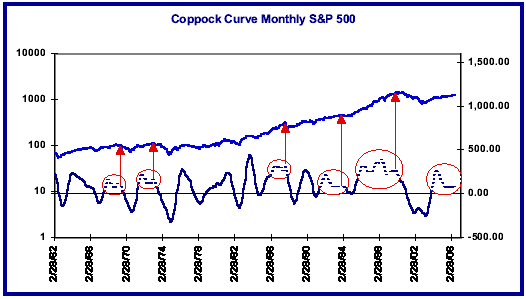
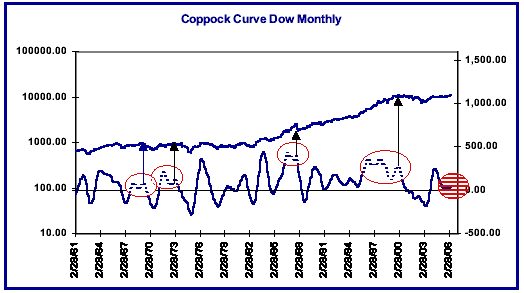
signals. A glance at the Coppock Curve charts on the front page
should make it clear that it might be difficult to formulate sell
signals based on the comparison between the Coppock Curve
and the underlying index that is used in its calculation. A
gentleman by the name of Don Hahn of A.G. Becker reportedly
made a discovery back in 1968 that if the Coppock Curve turns
up before it moves below zero, it sets up the possibility of a
dangerous signal which he entitled the Killer Wave. The
general rule formulated by Mr. Hahn was that such a signal
would be generated when the Coppock Curve turns up by 10
points or more within three months of a low above the zero level.
When the decline from a high on the Coppock Curve is a smooth
one which moves uninterruptedly below the zero level, no such
signal is given. If you examine both the Dow and the S&P
Coppock Curve charts, you will notice that circles have been
placed around the formations and they turned out to be very
effective warnings that significant market declines were about
to begin.
The current configuration of the Coppock Curve on
both the Dow and the S&P is open to interpretation. In both
cases, the Coppock Curve has turned up from above the zero
level, one of the main requirements for a Killer Wave signal to
be given. The Coppock Curve on the S&P 500 topped in May
2004 at 263.2 and fell to a low of 74.2 in July 2005. Within three
months, in October 2005, it had advanced over 10 points
(11.82), but it was a very close call.
The Dow Jones Industrial Average saw its Coppock
Curve also top out in May 2004 with a high of 252.7. It then fell
to low of 21.2 in June 2005, but the Dow Coppock Curve failed
to move over 10 points higher within three months so there is no
confirmation of the Killer Wave signal given on the S&P 500.
Longer-term subscribers may remember the frustration
that was engendered on several occasions in the 1990s
when it appeared that several of these signals were being given
on both the Dow and the S&P. Although ultimately one of those
signals coincided very closely with the important market top in
2000, you should be able to notice from these charts that several
such signals were given between 1993-1999 that led to little or
no decline at all.
The ideal situation with respect to this indicator would
be to see the indicator turn down once again. As you can see
from the circled areas, a turndown after a pause or advance that
begins from above the zero level has almost always led to
market declines of significance. We have placed arrows on the
charts to show you where these turn downs have begun on the
Coppock Curve and the consistency of the market declines
which occur after such a turn down is impressive. Should such
a turn down occur and result in a move below the zero level, it
would give the Coppock Curve another opportunity to issue
another of its time honored buy signals. That is where the
Coppock Curve has excelled over the past several decades. We
should note, however, that several premature buy signals were
issued on the Dow Jones Industrial Average after the all-time
high in the year 2000. Several if not all of those false signals
might well have been avoided, however, by placing a filter on any
advance from below the zero level and requiring that the
magnitude of the advance be greater than 5-10 points. As you
can see from the Dow chart, when the sharp advance from below
the zero took place in earnest in early 2003, the market reacted
bullishly as it has for almost all such Coppock Curve signals in
the past.
As a last commentary on these charts, we would ask
you to look at the very last circle on the S&P chart, the circle
which encompasses the movement of the Coppock Curve over
the past year or two. It encompasses a rare formation, a
relatively flat formation that has been continuing for almost 10
months now. We see only two other similar formations over the
past 45 years and they are both encompassed by the two circles
preceding the last one on the S&P chart. One of them led to the
top in the year 2000, but the prior one which occurred in 1993-
1994, although it did precede a quiet period of almost a year in
the market, did not lead to significant market damage. It will be
interesting to see how the current pattern resolves.
TECHNICAL INDICATORS
[Reserved for Subscribers]
MARKET PROJECTIONS
The market is entering a six month period of unfavorable
seasonality and it is doing so in the fourth year of a very
consistent 4 year cycle. In fact, if you double the 4 year cycle
and consider the history of the resulting eight year cycle, some
of the more important bottoms of the past 50 years have occurred
in that eighth year. That also means, however, that some
important declines have either occurred or terminated in that
eighth year. Consider the years 1990, 1982, 1974, and 1966. We
purposely left off the year 1998, the last eighth year because,
although there was a significant decline into an October bottom
that year, it was not characteristic of the four preceding eighth
years. Perhaps we can attribute that to the fact that it occurred
in the midst of the final spasms leading to the end of that phase
of the markets mania in 2000.
[Remainder is Reserved for Subscribers]
MUTUAL FUNDS
Rydex switchers bought the Rydex Tempest Fund at
37.62 on April 11 and exited the fund on April 28 at 36.50 for a loss
of 3.0% on the trade. Fidelity Select switchers are in the Fidelity
Select Gold fund. Fidelity switchers should be aware that there
was a 4.06 dividend issued from the Fidelity Select Gold fund on
April 7th, 2006. As usual, we assume that dividends are
reinvested in the fund.
As of May 1st, 2006, several Rydex index funds have
been renamed. The Rydex Titan Fund was renamed the Rydex
Dynamic S&P 500 Fund and the Tempest Fund was renamed the
Rydex Inverse Dynamic S&P 500 Fund. We have two different
specific model portfolios-one for Fidelity Select switchers and
one for Rydex Group switchers. How you distribute your own
portfolio is up to you as an individual.
www.StockMarketCycles.com


