
As recently as 10 days back, one of the technicians at stockcharts.com posted a blog based on the same chart. His chart included RSI as well, see below.
I would like to make 2 points here:
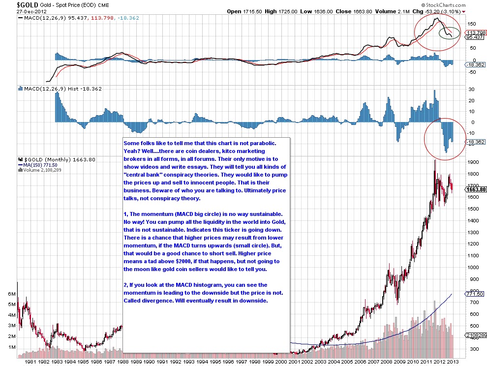
1, I have read many a posts about the similarities between 2008 bottom and 2013 bottom (??) in Gold. While the daily, weekly charts look similar, the monthly charts is where the real deals is. The RSI formed lower highs on its peaks. I only used MACD and then reading RSI but there are many indicators that are rolling over. Money flow doesn't lie!
2, 2nd major argument I read these days is the sentiment is overly bearish among gold bugs. Really? So, did everyone sell Gold and is waiting in cash looking for a bottom? I beg your pardon right here. WHile the namesake argument may be bearish, nobody sold their Gold. Everybody is still holding, waiting and looking for higher prices. Does the contrarian theory against the "internet bearish sentiment" hold good? I don't think so. Moreover, if the charts are actually looking like a bear, it truely means that it is a bear. You cannot call a tiger something else just because everyone calls it a tiger. It is a tiger, so you must call it a tiger as well.
Edited by DrSP, 14 March 2013 - 11:40 AM.

 But the motives of owning Gold are different for everyone. Mine is to sell in cascades based on levels broken downward. My selling can go all the way to 900$ where I would not own a single ounce. I guess you got my thought process. In simple words, I am waiting for the metal to confirm the bear, so that I can slowly return to cash. Net net I don't lose even if the pig goes ponzi or parabola.