
MarketSci kindly provided a spreadsheet to those who wanted to continue calculating the seasonal map on their own. I downloaded the spreadsheet, but was surprised to find that the methodology used was based on averaging every month over the last 20 years. In other words, they included every month, January through December, in the average. I am not saying that methodology is wrong, but it is not what I expected. So, I decided to modify the spreadsheet to calculate a seasonal map based on the average of the same single month over the last 30 years. For example, for April, I averaged the daily performance over the last 30 Aprils from 1984-2013. The resulting seasonal bias map for April 2014 is shown below.
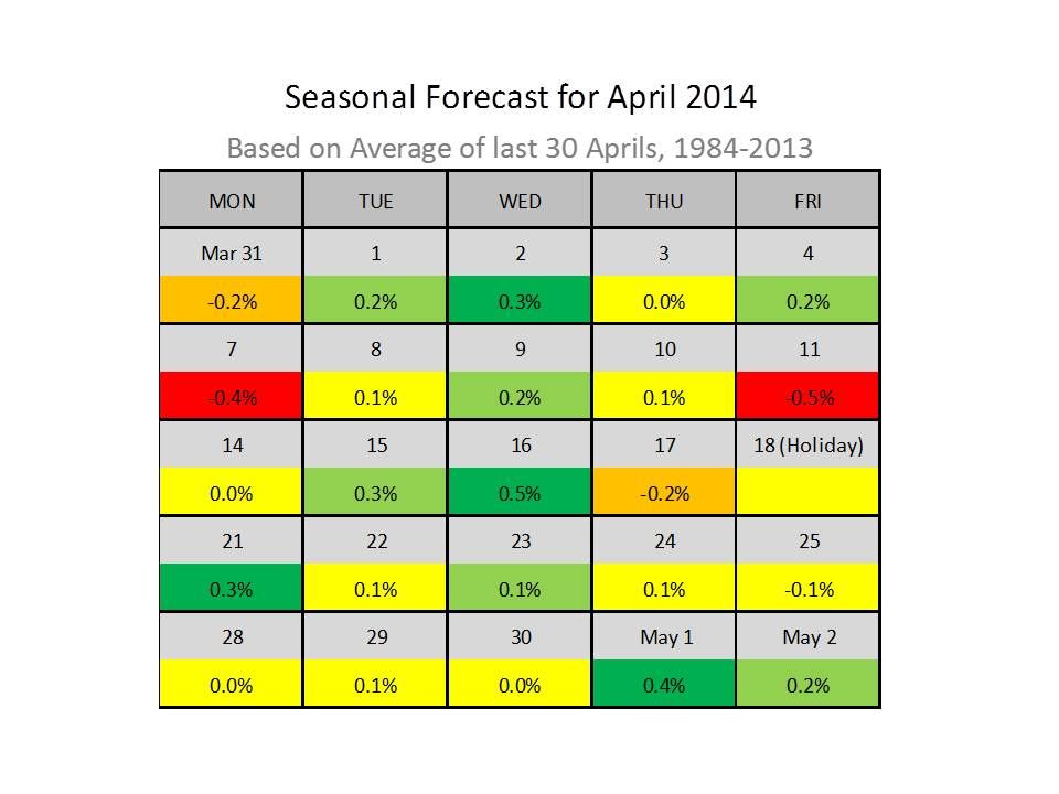
Days in green have a strong upward bias; light green days are mildly biased to the upside. Red days have a strong downward bias, and orange days are mildly negative. Yellow days are a toss-up. Those of you getting "beared-up" better prepare for April, which has a strong upward bias. Only 2 days, April 7 and 11, have a strong negative bias. In contrast, there are 3 strong up days and 5 mild up days forecast next month. In addition, the first two days in May are biased to the upside.
Not shown in the map, today and Friday are red days. Now may be a good time to take profits in short positions before April.
KMB


