

THE CYCLES
On December 31st, 2004, the Dow Jones Industrial Average closed at 10,783.01. Yesterday, September 1st, 2005, the Dow Jones Industrial Average closed at 10,459.63. It represents a closing price decline of almost exactly 3 percent certainly not a dramatic declinebut it was extraordinary in its own fashion. It was the first time in the history of the Dow Jones Industrial Average going back to 1897 that that Average was down after the first eight months of trading in a year ending in the digit 5. Perhaps we should not make too much of this phenomenon but it is difficult to ignore for several reasons. Towards the end of 2004 and the start of 2005 we reminded subscribers of the amazingly consistent success for the stock market in years ending in the digit 5. We also insisted, however, that the year 2005 stood an excellent chance of breaking that successful streak going back over 100 years. There was more than one reason for that prognosis but one of the main reasons was the virtually unprecedented streak of stubbornly bullish sentiment that we noted in the sentiment data from Investors Intelligence. Here is what we wrote in our January 2005 newsletter:
"The first thing that stands out is that the year 2004 did not contain one weekly reading with a plurality of bears over bulls. In fact, the plurality of bulls over bears was so steadfastly bullish throughout the year that the smallest plurality of bulls over bears was 9%. What makes that statistic all the more remarkable is that it was preceded by the same statistics throughout the year 2003. There was also not a single week with a plurality of bears over bulls in 2003 which meant there had been a mind set of steadfast bullishness for well over two years. The average plurality of weekly bulls over bears since March 2003 has been a staggering 31.4%. To put these data in perspective there have been only seven full calendar years in the history of Investors Intelligence (30 Church St., PO Box 2046, New Rochelle, NY 10801) data going back to 1964 were bullishness has been so great that a full calendar year escaped without seeing even one week with a plurality of bears over bulls. There has been only one other consecutive 2 year period such as we saw in 2003-2004. The other consecutive year pairing occurred in 1999-2000. The other years without one weekly reading of a plurality of bears over bulls were 1972, 1976, and 1983. With the exception of 2004 which saw the Dow advance a meager 3.1%, each and every year that has failed to see even one weekly reading with a plurality of bears over bulls has been followed by a negative year in the market."
As the last four months of the year 2005 begin, the amazing streak of bullishness has continued through another eight months. Whereas the average plurality of bulls over bears from March 2003 through December 2004 was 31.4%, the average plurality over the first eight months of this year has diminished only slightly to 28.3%. But consider the fact that the Dow Jones Industrial Average advanced over 43 percent from March 2003 through December 2004. Pervasive bullish sentiment in the face of a smartly advancing market is understandable. But when that bullishness persists at virtually the same levels over an eight month period of flat to downard market movement, the market is almost certainly going to get itself into trouble. It has always been our thesis that sentiment should be viewed in relation to the underlying market movement and we have been attempting to develop an indicator to measure that interdependence. We believe history has shown that stubbornly bullish sentiment during periods when the market makes little to no progress or even declines is a very negative sign. Thats exactly what we have been seeing since the Dow made its high of the year in early March.
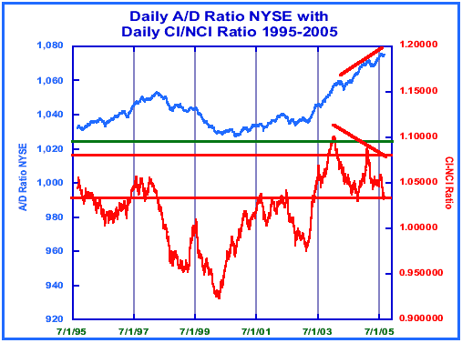
Lets examine the market internals to check on its technical underpinnings. The front page chart shows the daily advance/decline ratio of the New York Stock Exchange accompanied by our own CI/NCI ratio. We developed the CI/NCI ratio a few decades ago when we were seeking an objective way of measuring two of the markets more consistent cycles, a 39 week cycle and a 78 week cycle. We measure that cycle by examining daily advance decline data over a period of 189 trading days, the number of trading days closest to 39 weeks when one considers market holidays. It is the half span of the 78 week cycle. The indicator has been very helpful to us and we have used it in varying ways. Market tops are usually formed with the CI/NCI ratio somewhere between 1.035 and 1.080. That range is delineated by the two broad horizontal lines (in red for those of you that have color charts) on the front page chart. Almost all important market tops are formed with the CI/NCI ratio somewhere within that rather broad range. We will return to the latest readings in a moment, but first we refer you to the third horizontal line just under the 1.10 reading on the right hand scale. Any move above that line is extraordinary and rare. On January 12th, 2004, the CI/NCI ratio reached a high of 1.101, well above the 1.095 reading that we have used as a parameter to mark very high momentum breadth moves signaling powerful and sustained market moves to follow. In fact, in our newsletter dated March 5th, 2004, we wrote:
"There is no time in market history going back to the 1920s where a reading that high [above 1.100] occurred anywhere near a market top... Perhaps a top will be formed in very different fashion this time around, but it is always dangerous to assume this time might be different. Perhaps the answer is that we are at or near a potentially important top in relation to the next few years of market history but that the top will form over a much longer period of time."
That paragraph was written 18 months ago and it strikes us immodestly as having been eerily perceptive. On the date of that newsletter, the Dow closed at 10,595.55. As this newsletter is being written, the Dow has just closed at 10,459.63. Since the Dow close on March 5th, 2004, it has never closed more than 3.3% above that March 5th, 2004 close. In other words, the Dow was at that time near a potentially important top in relation to the next few years of market history and that top (if that's what it turns out to be) has formed over a relatively long period of time.
All that is true and yet there has been another real truth underlying the markets inability to initiate any decline of significance over the past 18 months. Look at the daily advance/ decline ratio, the upper of the two lines on the front page chart. After the CI/NCI ratio ventured into that rare territory above 1.095 in early 2004, the advance/decline ratio suffered a shortterm decline. Since then, however, it has continued its rapid ascent to multi decade highs at the same time as the advance/ decline line has moved to new all-time highs (note the distinction between advance/decline ratio and advance/decline line). In that fashion, the CI/NCI ratio reading above 1.095 in early January 2004 was indeed correct in predicting a powerful and sustained market move.
Now lets return to the price action of the past year on the front page chart. When the next peak was reached on the advance/decline ratio almost exactly one year later in March 2005, the CI/NCI ratio was still higher than the upper of the two horizontal lines generally marking the parameters for a market top. It did not, however, reach the very high momentum reading above 1.095 that would have suggested once again extremely high momentum and a continuing long-term advance. It did suggest, however, that a final top had not yet been seen in market breadth. After a decline into mid to late April of this year, the advance/decline ratio initiated a move to even higher highs.
Those highs are represented on the upper line of the chart just above the date label of 7/1/05. Now look at the CI/NCI ratio represented by the lower line on the chart and note the dramatic difference in the readings at the most recent highs in the advance/decline ratio. The readings reached at his peak were well within the two broad horizontal lines defining the range generally seen at important market tops. Not only that, but notice the divergences between the upper and lower line since the initial peak in March 2004. The dramatic negative divergence of the CI/NCI ratio coupled with the fact that it is finally seeing readings in a range consonant with a possible market top leads us to note that a possible top of significance is being formed. Adding fuel to that possibility is the fact that the CI/NCI ratio appears close to breaking below the recent lows in October 2004. A convincing break below those lows by the CI/NCI ratio would present a longer term pattern of a high below a previous high and a low below a previous low. All of this could be happening even as the daily advance/decline ratio is only one month away from its recent high. In fact, both the advance/ decline line and the advance/decline ratio are close enough to their recent highs that they could register even higher highs while the CI/NCI ratio was languishing at or near two year lows. That could paint an ugly technical picture indeed.
TECHNICAL INDICATORS
We have spent some time over the past few weeks reviewing our Sign of the Bear indicator. The history of the indicator is truly remarkable. Perhaps this is an opportune time to review the indicator rules and explain how the signal is generated. The signals over the past 76 years have occurred at or proximate to market tops. Perhaps more importantly, the scant history (there have been only seven signals given in the past 76 years) of the signals shows they have had a knack for virtually pinpointing not only market tops but starting points preceding substandard market performance for years and even decades to follow. Dont ask us how a simple four or five week pattern in advances and declines on the New York Stock Exchange can accomplish such legerdemain. It may be a statistical anomalypure coincidence that has no true correlation to what follows. On the other hand, because it has worked so well, we would be foolish to write it off as pure coincidence until we see the results of future occurrences of the pattern.
The crux of the pattern is a series of consecutive churning days that lasts for at least 21 trading days (the average number of trading days in a market month). A churning day is defined as a day when the advance/decline ratio on the New York Stock Exchange is below 1.95 but above 0.65. Those are indeed arbitrary parameters but they appeared to work best in isolating the pattern. The next requirement is somewhat controversial because it smacks of curve fitting. If the number of consecutive churning days exceeds 27, the pattern loses much of its efficacy in predicting long-term bearish resolutions. So the first requirement for a signal is to identify a time period when there have been at least 21 but no more than 27 consecutive churning days before the consecutive streak is ended. The second rule is the streak must be ended with a negative day, not a positive one. In other words, there must be a day with an advance/decline ratio less than 0.65. If the street is ended with a positive resolution, an advance/decline ratio greater than 1.95, it does not qualify as a potential Sign of the Bear. The final rule is that the average advance/decline ratio two or three days after the churning ends must be less than 0.75. To judge this requirement, simply calculate the daily advance/decline ratio for the three days following the end of the pattern (including the day that broke the consecutive streak). Calculate the average advance/decline ratio for both the first two days and the first three days after the pattern ends, and if either of these two averages is below 0.75, a Sign of the Bear has been given. This assures the negative break was real, not a one day wonder.
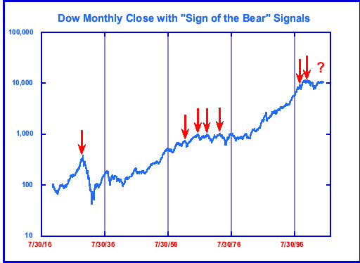
Those are the rules. The chart in this section shows you the results of those rules as applied to the Dow Jones Industrial Average. The dates of those signals are: July 22nd, 1929 December 14th, 1961 January 31st, 1966 October 25th, 1968 December 12th, 1972 April 6th, 1998 September 18th, 2000.
Notice how the 1929 top was unusual in that it formed in the shape of an inverted V. Most market tops have been broadly formed. There was only one Sign of the Bear signal given preceding that top and it was superbly timed. It not only warned of the potential decline which was to occur but it was a precursor to poor market performance for the next quarter of a century. Thats how long it took the market to regain the losses generated after that first Sign of the Bear signal. The December 1961 and the April 1998 signals seem to be somewhat analogous. They both led to almost immediate market declines, but more importantly, each of them was the first Sign of the Bear signal given in over 25 years. It was as if a warning were being given that the pattern of the previous 25 years, a pattern of continuously rising stock prices, was about to end. In both cases there was a last-ditch rally into market tops that had the potential of being very long-lasting. In fact, in the case of the April 1998 Sign of the Bear signal, it marked the almost exact top for the daily advance/decline line, a top which only recently has been exceeded.
What is the purpose of this exercise which deals with prior market history? It is our opinion based on a close observation of the prior patterns for the Sign of the Bear that there will be another Sign of the Bear prior to the next great market decline. That is not to say we wont see an intermediate-term decline occur before another signal is given, but it seems the current pattern is much like the pattern of the 1960s and 1970s whereby Sign of the Bear signals not only warned of the probability of a sharp market decline, they also warned there would be a long period of time following each signal before the market resumed its historical upwardpath. That pattern should be very clear from the long-term monthly chart presented in this section of the newsletter. With the exception of the analogous 1961 and 1998 signals discussed above which served to mark the last stop before the end of long-term secular bull markets, all the other signals were followed by at least a decade before significant new highs were made in the stock market.
MARKET PROJECTIONS
As the week ending September 2nd comes to close, our weekly projection charts for the New York Composite Index show there are no downside projections outstanding. Last week a nominal 10 week downside projection was generated but that projection has been invalidated this week. In fact, the only downside projection outstanding on any of the major indexes we examine on the weekly projection charts is a nominal 78-80 week downside projection on the Dow Jones Industrial Average calling for 9994 ± 100 points on an intraday basis. Even that projection cannot be considered high confidence simply because none of the other indexes has confirmed by generating its own nominal 78-80 week projection. Frankly, none of the weekly projection charts looks as if it is in position to generate significantly lower projections at this point. That situation can change quickly but that is its current status.
MUTUAL FUNDS
All mutual-fund switchers are currently in 100% cash positions. Rydex switchers entered the Rydex Tempest Fund at the morning pricing on August 12th (the Rydex Dynamic funds are priced twice each day) based on our instructions on our August 11th daily update and special mutual-fund update. The fund was bought at 40.76. On August 29th, we posted a special mutual-fund update before 3:20 p.m. Eastern time recommending the sale of the Rydex Tempest Fund at the close that market day. The fund was sold at 42.14 for a gain of 3.4% on the trade.
We continue to research and implement our monthly Seasonality mutual-fund program. Since the program began trading in late February, the results show a gain of 13.4% through todays close, September 2nd. Over that same period of time the Dow Jones Industrial Average is down 2.8% and the S&P 500 index is up 1.5%. It is important to remember that the Seasonality program is out of the market 70% of the time gathering risk free interest.
We have two different specific model portfolios one for Fidelity Select switchers and one for Rydex group switchers. How you distribute your own portfolio is up to you as an individual.
NOTE: We would like to remind subscribers that we are now managing money through the use of mutual fund timing. This relieves you of the stress of wondering whether you missed a signal or whether you will reach your fund in time to make a switch. Our management company is called, appropriately enough, Stockmarket Cycles Management, Inc. If you would like additional information regarding this service, please call the office (800) 888-4351 or e-mail us at suedavy_smc@comcast.net anytime.
Stockmarket Cycles is published the first Friday of the month by Peter G. Eliades. Information is gathered as carefully as possible, but no guarantee can be made as to the accuracy of text or charts. The analysis of stock market cycles is more an art than a science. No guarantee can be made that recommendations will be profitable or will not result in losses. This subscription will not be reassigned without the consent of the subscriber. All information contained herein and given on the telephone update may not be reproduced or rebroadcast in any form whatsoever without the written consent of Peter G. Eliades.
1 year (12 issues) letters only $252.00 6 months (6 issues) with daily telephone update $261.00
1 year (12 issues) with daily telephone update $480.00 2 issue trial with daily telephone update $98.00
J. (James) M. Hurst was born in Salina, Kansas on September 2nd, 1924 and died in his sleep on August 18th, 2005 in Roseville, California, just weeks short of his 81st birthday. It is safe to presume that virtually everyone who has pursued a serious study of cycles in the stock market over the past 30 years or so was in some way inspired to do so by Hursts 1970 classic, The Profit Magic of Stock Transaction Timing. That was certainly true in my case.
J.M. Hurst has surely earned a place in the pantheon of legendary stock market geniuses. His influence on my professional life was immeasurable. Although much of his life over the past 30 years is shrouded in mystery, there is nothing mysterious about the legacy he has left all of us in the field of technical analysis. May his memory be eternal!
Next Publication Date: October 7, 2005


