Jump to content


Photo

The MACD


  • Please log in to reply
1 reply to this topic

#1 Guru Dudette

Guru Dudette

    Prince of Dorkness

  • Admin
  • 835 posts

Posted 31 January 2007 - 11:16 AM

The MACD

The MACD, invented by Gerald Appel, stands for "Moving Average Convergence-Divergence". This tool identifies and measures the trend of the market and gives an indication of likely importance of that trend. The MACD (pronounced "Mack Dee") can be used over multiple time frame charts from 1-minute to monthly and quarterly charts.

The MACD, when used in its "line" form, incorporates three exponential moving averages (EMA's) to produce two chart lines. The first line is the fast MACD Line, and is almost always represented by a blue or green line. The second line is the slow Signal Line,or a 9-period EMA, which is represented by a red line.
The standard MACD indicator is the result of plotting the fast and slow lines, and watching for when the fast line crosses the slow line.

Posted Image

These lines fluctuate with market direction. When analysts use this as a trend following tool, the MACD is a simple crossover indicator with very simple buy/sell signals. You buy when the blue or "fast" MACD Line crosses above the "slow" red Signal Line, and you sell when the MACD Line crosses below the Signal Line. Even used in this very simple manner, with nothing else, the indicator can provide the basis of a perfectly adequate trend following system that will stay in synch with the trend.

Another way you can use the MACD is to look for certain patterns, such as a "Kiss of Death" where the MACD rises to just "kiss" the signal line before turning down. This is very bearish. Similarly there is the "Double Pump" where the MACD crosses over its signal line and then crosses back. This often brings a fast and relatively dramatic move in the direction of the cross-over.

Using a combination of hourly, daily and weekly MACD readings, you can fine tune your buying and selling. Some folks take the direction of your trade from the MACD indicator on your weekly chart, but picking your exact entry point from the MACD reading on the daily chart. (If it's a buy entry you're looking for, you'd want the weekly indicator to be bullishly rising but the daily indicator to dropping, so you get an advantageous entry price).

We have found that the weekly MACD is more useful when the direction of the fast line is considered instead of the cross over the signal line. One caveat, the MACD should only be considered on a closing basis. Many is the time that the Daily MACD appears to be giving a Sell during the day, but rebounds and actually generates a Buy. On the Weekly MACD, this is only more valid.


"I'd rather be vaguely right than precisely wrong." J.M.Keynes

#2 TTHQ Staff

TTHQ Staff

    www.TTHQ.com

  • Admin
  • 8,597 posts

Posted 01 February 2007 - 09:52 AM

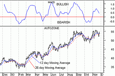
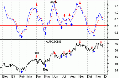
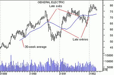
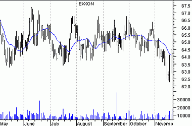
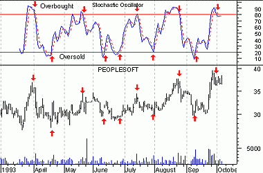
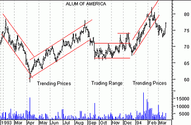
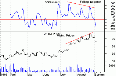
The MACD is calculated by subtracting a 26-day moving average of a security's price from a 12-day moving average of its price. The result is an indicator that oscillates above and below zero. When the MACD is above zero, it means the 12-day moving average is higher than the 26-day moving average. This is bullish as it shows that current expectations (i.e., the 12-day moving average) are more bullish than previous expectations (i.e., the 26-day average). This implies a bullish, or upward, shift in the supply/demand lines. When the MACD falls below zero, it means that the 12-day moving average is less than the 26-day moving average, implying a bearish shift in the supply/demand lines. The chart below shows Autozone and its MACD. I labeled the chart as "Bullish" when the MACD was above zero and "Bearish" when it was below zero. I also displayed the 12- and 26-day moving averages on the price chart. 1.gif A 9-day moving average of the MACD (not of the security's price) is usually plotted on top of the MACD indicator. This line is referred to as the "signal" line. The signal line anticipates the convergence of the two moving averages (i.e., the movement of the MACD toward the zero line). The chart below shows the MACD (the solid line) and its signal line (the dotted line). "Buy" arrows were drawn when the MACD rose above its signal line; "sell" arrows were drawn when the MACD fell below its signal line. 2.gif The MACD is the difference between two moving averages of price. When the shorter-term moving average rises above the longer-term moving average (i.e., the MACD rises above zero), it means that investor expectations are becoming more bullish (i.e., there has been an upward shift in the supply/demand lines). By plotting a 9-day moving average of the MACD, we can see the changing of expectations (i.e., the shifting of the supply/demand lines) as they occur. Leading versus lagging indicators Moving averages and the MACD are examples of trend following, or "lagging," indicators. [See chart below] These indicators are superb when prices move in relatively long trends. They don't warn you of upcoming changes in prices, they simply tell you what prices are doing (i.e., rising or falling) so that you can invest accordingly. Trend following indicators have you buy and sell late and, in exchange for missing the early opportunities, they greatly reduce your risk by keeping you on the right side of the market. 3.gif As shown in the chart below, trend following indicators do not work well in sideways markets. 4.gif Another class of indicators are "leading" indicators. These indicators help you profit by predicting what prices will do next. Leading indicators provide greater rewards at the expense of increased risk. They perform best in sideways, "trading" markets. Leading indicators typically work by measuring how "overbought" or "oversold" a security is. This is done with the assumption that a security that is "oversold" will bounce back. 5.gif What type of indicators you use, leading or lagging, is a matter of personal preference. There have been several trading systems and indicators developed that determine if prices are trending or trading. The approach is that you should use lagging indicators during trending markets and leading indicators during trading markets. While it is relatively easy to determine if prices are trending or trading, it is extremely difficult to know if prices will trend or trade in the future. 6.gif A divergence occurs when the trend of a security's price doesn't agree with the trend of an indicator. The chart below shows a divergence between Whirlpool and its 14-day CCI (Commodity Channel Index). Whirlpool's prices were making new highs while the CCI was failing to make new highs. When divergences occur, prices usually change direction to confirm the trend of the indicator as shown in this chart. This occurs because indicators are better at gauging price trends than the prices themselves. 7.gif