Weekly......bullish IT to LT
http://stockcharts.com/c-sc/sc?s=$NDX:$SPX&p=W&yr=10&mn=8&dy=0&i=p33811848522&a=114984972&r=4661.png

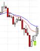
NDX:SPX
Started by
eminimee
, Nov 03 2007 11:13 AM
6 replies to this topic
#1

eminimee
-
- TT Member
- 14,307 posts
I don't care who's fur is flying...
Posted 03 November 2007 - 11:13 AM
#2
borland
-
- Traders-Talk User
- 276 posts
Member
Posted 03 November 2007 - 11:54 AM
Slightly different than your other chart going back past 94' Why's that?
Here's your chart from your blog...
http://stockcharts.com/c-sc/sc?s=$SPX&p=M&st=1987-01-01&i=p89395564987&a=68755843&r=2799.png
Meant to say the 01' ratio peak...
Here's your chart from your blog...
http://stockcharts.com/c-sc/sc?s=$SPX&p=M&st=1987-01-01&i=p89395564987&a=68755843&r=2799.png
Meant to say the 01' ratio peak...
#3
eminimee
-
- TT Member
- 14,307 posts
I don't care who's fur is flying...
Posted 03 November 2007 - 12:02 PM
What's different? On one I've got ndx:spx ratio in line form...the one I just posted is in candle form. Be specific....what's different?
#4
borland
-
- Traders-Talk User
- 276 posts
Member
Posted 03 November 2007 - 12:40 PM
Sorry,
You have the wedge on both charts, but the ratio brakeout level on the longer chart is currently higher. 01' vs. 03', that's all.
One chart is monthy the other a weekly. But I don't see why that would affect the peak value.
It's also interesting to see on longer chart, that $USD has broken down, out of the box.
#5
eminimee
-
- TT Member
- 14,307 posts
I don't care who's fur is flying...
Posted 03 November 2007 - 01:05 PM
the box on the usd was only there to signify a comparible bottom....it had nothing to do with price....so dropping out of the bottom means nothing....I've moved it for you....also made the ndx:spx candle form on that chart. Everyone happy?
http://stockcharts.com/c-sc/sc?s=$SPX&p=M&st=1987-01-01&i=p41133014374&a=68755843&r=780.png
http://stockcharts.com/c-sc/sc?s=$SPX&p=M&st=1987-01-01&i=p41133014374&a=68755843&r=780.png
Edited by Teaparty, 03 November 2007 - 01:06 PM.
#6
borland
-
- Traders-Talk User
- 276 posts
Member
Posted 03 November 2007 - 05:17 PM
TP,
Happy? Well, not exactly.
Now we see that the ratio trendline in your longer chart, is based on the monthly closing price. So the line is hiding the true support/resistance ratio price levels that's built into the market volitility.
That puts into question your "red" resistance level for the $oex:$spx, as possibly not being a valid brake out level.
See what I mean?
#7
eminimee
-
- TT Member
- 14,307 posts
I don't care who's fur is flying...
Posted 03 November 2007 - 06:53 PM
I really don't know what you mean...and quite frankly I think you're being a bit picky...I don't know what you want to see.
Try this
http://stockcharts.com/c-sc/sc?s=$OEX...4216&r=6781
Try this
http://stockcharts.com/c-sc/sc?s=$OEX...4216&r=6781


