some of us are about to be very suprised. m2 has been in constant decline for months and the money multiplier remains below zero according the to the latest Fed Report. Keeping it simple this means not only is less NET money being pushed into the economy by the Fed[deflationary dissappearance of money is MORE than the credit creation of the Fed] but all such acts by the Fed are resulting in DECREASED monetary expansionary in the economy as the MM is below zero. For the past 20-25years the Aussie markets remains an excellent leading indicator the US stock market. This time wont be different.

IN CYCLES WE TRUST
Started by
voltaire
, May 16 2010 05:50 AM
42 replies to this topic
#22

voltaire
-
- Traders-Talk User
- 1,134 posts
Member
Posted 16 May 2010 - 03:56 PM
some of us are about to be very suprised. m2 has been in constant decline for months and the money multiplier remains below zero according the to the latest Fed Report. Keeping it simple this means not only is less NET money being pushed into the economy by the Fed[deflationary dissappearance of money is MORE than the credit creation of the Fed] but all such acts by the Fed are resulting in DECREASED monetary expansionary in the economy as the MM is below zero. For the past 20-25years the Aussie markets remains an excellent leading indicator the US stock market. This time wont be different.
Just for interest, here is an indicator suppposedly based on "the master time factor". Software from Market Warrior.
It is a ASX200 (Aussie) chart and the last bar is just based on how the market is expected to open based on overnight futures.
Looks eerily similar, and only using limited data.

#23
relax
-

- Traders-Talk User
- 2,224 posts
Member
Posted 16 May 2010 - 04:01 PM
voltaire do you have a link to aussie futures
thanks
#24
milbank
-

- TT Patron+
- 4,714 posts
Member
Posted 16 May 2010 - 04:15 PM
The liquidity difference just comes out as inflation.
If you adjust the plots for inflation you get a different story.
See this dshort plot:
http://dshort.com/ch...r-2000-extended
You can be long in a seemingly bull market and still lose value.
The reason I used the nominal versus the inflation adjusted is that inflation via the CPI is computed completely differently than it was in the '30s. The CPI was recalibrated in '90s to keep fixed income and raises that are usually based on the CPI lower. The changes to how the CPI is calculated in the '90s was part of the political corruption of the economy to make things seem better than they were/are. It is so perverted as to not reflect true inflation. The "chickens are now going to come home to roost" on that adjustment. The key to me is not what is reflected through this perversion but, what the market itself does. That being said, even using the inflation adjusted chart, the trajectory is still the same. It's just that where you start from is different.
Edited by milbank, 16 May 2010 - 04:21 PM.
"The power of accurate observation is commonly called cynicism by those who have not got it."
--George Bernard Shaw
"None are so hopelessly enslaved as those who falsely believe they are free."
--Johann Wolfgang von Goethe
#25
Not Too Swift
-

- Traders-Talk User
- 2,089 posts
Member
Posted 16 May 2010 - 04:31 PM
The liquidity difference just comes out as inflation.
If you adjust the plots for inflation you get a different story.
See this dshort plot:
http://dshort.com/ch...r-2000-extended
You can be long in a seemingly bull market and still lose value.
The reason I used the nominal versus the inflation adjusted is that inflation via the CPI is computed completely differently than it was in the '30s. The CPI was recalibrated in '90s to keep fixed income and raises that are usually based on the CPI lower. The changes to how the CPI is calculated in the '90s was part of the political corruption of the economy to make things seem better than they were/are. It is so perverted as to not reflect true inflation. The "chickens are now going to come home to roost" on that adjustment. The key to me is not what is reflected through this perversion but, what the market itself does. That being said, even using the inflation adjusted chart, the trajectory is still the same. It's just that where you start from is different.
The inflation adjusted chart does not look like a head and shoulders as the one listed above does.
I agree with all you say about the corruption, but still the inflation adjusted chart I linked to is closer to the truth than the nominal chart.
My real point is that all of the talk about liquidity does not change the fact that today we are still at a lower high so far.
Until it rises above the previous high in the chart, in inflation adjusted terms, all of that liquidity has not generated anything more than a cyclical bull market in a secular bear market.
Austrian theory would say that it is doomed to fail in that attempt.
I think fib has said that the liquidity will cause this cyclical bull to go two more years or so, and I would guess he is thinking about what happened in the early 2000s.
Maybe it will go on for a while again, but I am very skeptical that it goes above the previous high -- in inflation adjusted terms.
Nominal terms just give the crooks in Washington a bragging vehicle, but they may engineer that much.
By the way, have you thought about showing a chart of Dow/gold or SPX/gold instead?
Since the 1970s, that might be truer reflection of inflation adjustment.
(I now see that a Dow/gold chart is linked above, and that the head and shoulders chart was in another thread. Sorry. NTS)
Edited by Not Too Swift, 16 May 2010 - 04:36 PM.
I let the market tell me what to do. The trouble is she mumbles a lot, and I'm hard of hearing.
1576 ONO. Upside down, reverse, inside out, snort...
1576 ONO. Upside down, reverse, inside out, snort...
#26
fib_1618
-

- Traders-Talk User
- 10,145 posts
Member
Posted 16 May 2010 - 05:26 PM
If you're comparing Aussie market with that of the NASDAQ market, one could note similarities between the two as the make up of both correlate well. But when compared to the NYSE, this statement is absolutely not consistent to the facts.For the past 20-25years the Aussie markets remains an excellent leading indicator the US stock market.
Yes, 2002-2003, but the same can be said of 1953-1954, 1963-1964, and to a lesser degree, the 1984-1985 time frames as well.I think fib has said that the liquidity will cause this cyclical bull to go two more years or so, and I would guess he is thinking about what happened in the early 2000s.
Again, it's important to understand the concept that although there may be many fuel stations in ones travels, with different additives and grades (M2 etc.), what only counts in making your car (stocks) go is the one energy source that's put directly into your tank (excess liquidity) so that when you press the accelerator you move in the desired direction. Wear and tear on the vehicle (inflationary price adjustments) are just part of the depreciation factor involved with the product. So what the A/D line (fuel gauge) gives us to work with is the likely direction of price, as well as, how fast or how slow we're likely to attain a given objective forecasted by other methodologies.
Fib
Better to ignore me than abhor me.
“Wise men don't need advice. Fools won't take it” - Benjamin Franklin
"Beware of false knowledge; it is more dangerous than ignorance" - George Bernard Shaw
Demagogue: A leader who makes use of popular prejudices, false claims and promises in order to gain power.
Technical Watch Subscriptions
#27
CLK
-

- Traders-Talk User
- 10,787 posts
Member
Posted 16 May 2010 - 06:22 PM
Fib,
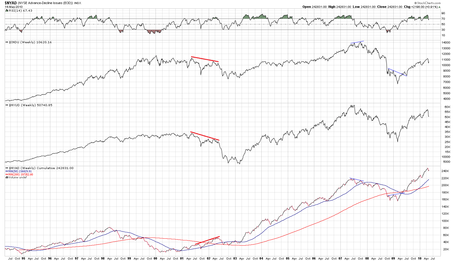
The way I read NYAD is about as bearish as it gets, when it is
at all time highs and price is nowhere near, they threw all but
the kitchen sink at it to no avail.
#28
fib_1618
-
- Traders-Talk User
- 10,145 posts
Member
Posted 16 May 2010 - 06:56 PM
As we previously discussed, there is a marked difference between liquidity availability and the actual process of putting it to work. Since we are dealing with weighted indexes, it will take new highs in the higher weighted cream of stocks that make up the NYUD to show that this same liquidity quotient is actually being utilized according to what is being forecasted.when it is at all time highs and price is nowhere near
To put it another way, with the NYUD still below its all time highs, and NYAD at or near its all time highs, this highly suggests that there is a large sum of capital availability still sitting in other areas waiting for the right time to be allocated into stocks. When we finally do see this allocation process, we will then see new all time highs in many of the major market indices based solely on the weighted math being used.
So aside from an all out collapse in the current free market economic structure, until we see a divergent structure between the NYAD and the NYA, or that the NYAD actually leads prices in a bearish direction, the current intermediate to longer term trend for prices remains higher.
Fib
Better to ignore me than abhor me.
“Wise men don't need advice. Fools won't take it” - Benjamin Franklin
"Beware of false knowledge; it is more dangerous than ignorance" - George Bernard Shaw
Demagogue: A leader who makes use of popular prejudices, false claims and promises in order to gain power.
Technical Watch Subscriptions
#29
BigBadBear
-

- Traders-Talk User
- 1,007 posts
Member
Posted 16 May 2010 - 07:04 PM
The correct analogy is that their is 1 fuel source[liquidity] and 10 cars[ all markets, retail, etc]. The fuel source is not being 'replenished at high enough levels to keep the 10 cars running'[aka multiplier below 1 and rolling deflation since 2007] around the track and the cars are running low on fuel however since fuel is still being supplied, though at a lower rate than is required, a decision is made by a council of few to keep 2 cars[stock, commodity indices] replenished at adequate levels at the expense of the other 8 cars with the hope that the illusion can be maintained and the multiplier goes above 1 again. So the a/d line[fuel gauge] on the 2 cars shows all is well but the fuel source is drying up at an exponential rate and the 8 other cars[real estate, retail yr/yr, etc] are decelerating to a complete stop.
The result is that sudden 'liquidy holes' are starting to appear.. crash last week, etc but the diversion of fuel is still occuring and while the gauge for the 2 cars is still showing full, at ANY TIME a liquidity hole can appear when the diversion of fuel is not smooth and of course ultimately the source of fuel is decreasing exponentially all the time which means that at some point the 2cars will not be replenished at the correct rate. This is currently happening.
Unless you force the banks to lend, force the brokerages to buy stocks AND drop money from the sky, the multiplier will remain negative, deflation will speed up leading to vastly less fuel supplies and a significantly lower market.
Edited by BigBadBear, 16 May 2010 - 07:12 PM.
#30
CLK
-
- Traders-Talk User
- 10,787 posts
Member
Posted 16 May 2010 - 07:13 PM
As we previously discussed, there is a marked difference between liquidity availability and the actual process of putting it to work. Since we are dealing with weighted indexes, it will take new highs in the higher weighted cream of stocks that make up the NYUD to show that this same liquidity quotient is actually being utilized according to what is being forecasted.when it is at all time highs and price is nowhere near
To put it another way, with the NYUD still below its all time highs, and NYAD at or near its all time highs, this highly suggests that there is a large sum of capital availability still sitting in other areas waiting for the right time to be allocated into stocks. When we finally do see this allocation process, we will then see new all time highs in many of the major market indices based solely on the weighted math being used.
So aside from an all out collapse in the current free market economic structure, until we see a divergent structure between the NYAD and the NYA, or that the NYAD actually leads prices in a bearish direction, the current intermediate to longer term trend for prices remains higher.
Fib
Going back up for a divergent top is what everyone is looking for since
07 topped that way. It might still happen, but bear market rules may be different,
we had price diverging with internals in 02(even though not at all time highs, I know),
but price did not follow.